Scientific Illustration
Click the image to read more about each project.
Research Posters
Click the image to read more about each project.

Hello! My name is Tember.
I'm a multi-disciplinary artist and educator from the US.
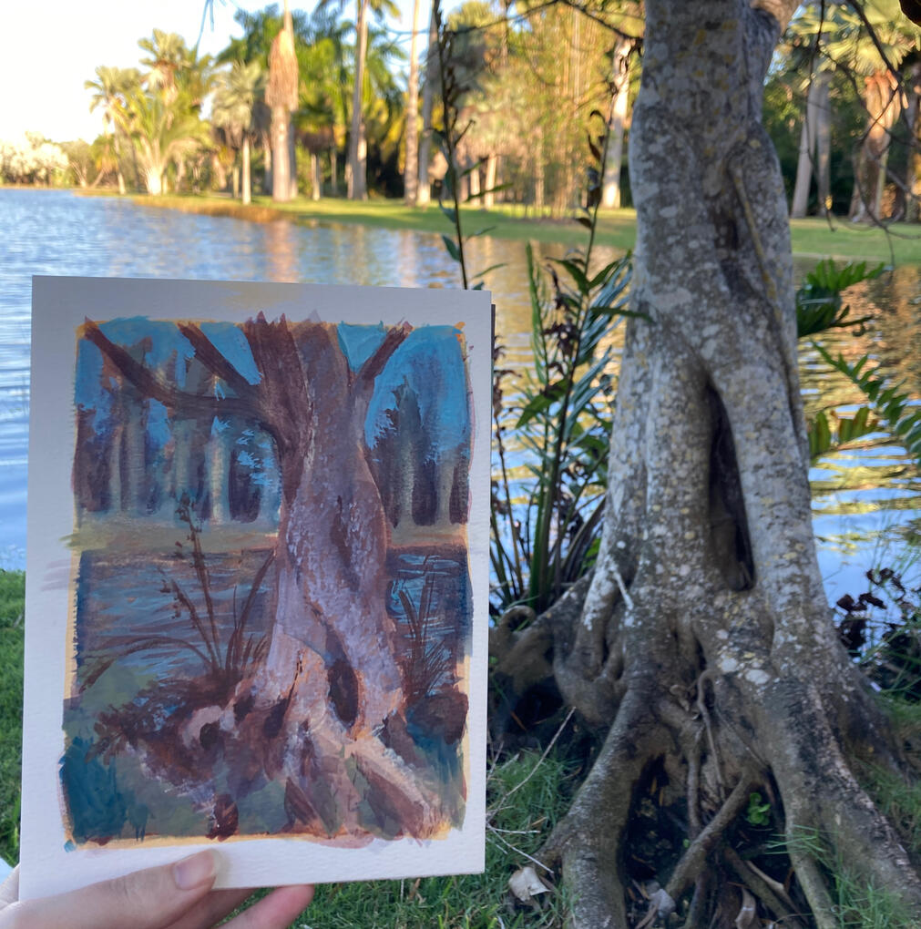
I've been creating engaging educational materials for eight plus years and teaching for four of them. My unique background in design, education, and science lends itself to quick ideation and interesting material design.Helping others learn is one of my greatest passions. Creating the materials sweetens the pot a little more.When I'm not working, I volunteer with non-profits in my area and combine my love of nature and art by finding the perfect spots for plein-air painting.If you would like to commission me for illustrations or material design, please contact me at tember.andong@gmail.com or via LinkedIn.
Remote Lessons
I taught in Andong, South Korea, for three years, with parts of those years being taught remotely due to COVID-19 mandates. I created online and offline lesson plans, activities, and materials for students in grades 3-6. English lessons were taught with a Korean co-teacher, who, depending on personal preference, would lead the class or assist. When teaching remotely, we released video lessons daily for students, with supplementary materials depending on the lesson's needs.Featured are materials for 5th grade, where I was the main teacher for the co-taught lessons. My co-teacher, Mr. Kim, was fantastic, giving students space to try harder topics and only hopping in individually if they needed it. I created all presentations and lesson plans in Google Slides so that we could share the files together for editing and correcting Korean. We would share those same Slides with students for their personal review after the lesson.
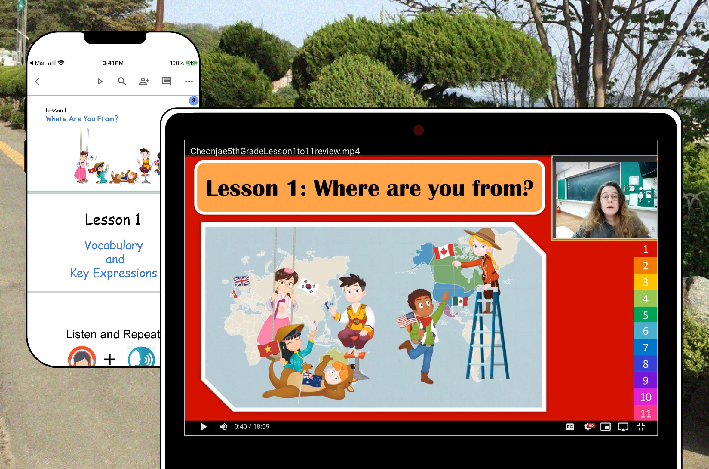
Review video lesson example
This was the one of the longer videos made for students, as it reviewed all of the lessons taught during the school year. I told students it was only going to be around ten minutes, but it was a lie. When teaching English as a second language, I speak slower and do more gestures.Here is a video link to the big Lesson 1 - 11 review if you can't view it here.We filmed all videos using a Korean screen capture software or Camtasia, with school provided cameras and microphones.
Remote Teaching Lessons
Due to the workload required for making so many lessons with videos in such a short time, I came up with a system to make my work with Mr. Kim convenient for the both of us. We would use Google Slides to organize all of our lessons so that we could each make fixes to the same slides during free time in our busy schedules.I would create a single Google slideshow to outline the whole lesson. Each chapter slide was the start of a new video. Despite teaching remotely, we still tried to create lessons that followed the PPP (Present, Practice, and Produce) lesson structure.A typical class video would go as follows:1. Start on the slide for the new chapter.
2. Introduction: Brief hellos, followed by checking previous bookwork, a skit between the teachers, an activity in the slides, or a video.
3. Present and Practice: Using the online textbook and book activities.
4. Produce: Homework or activity in the slides or elsewhere.Students would send in a picture or video of their homework when requested. A link to the daily section of the Google Slide was made available for students to use later for review.
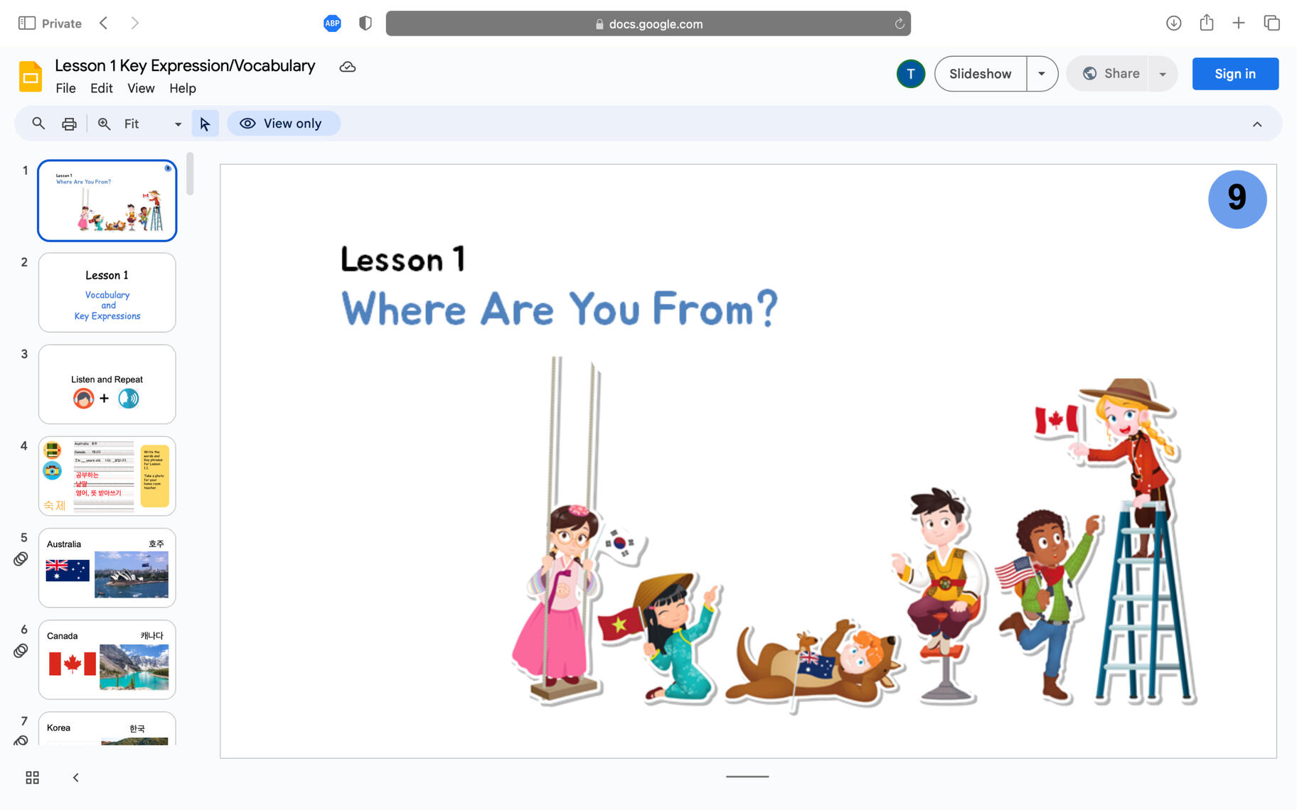
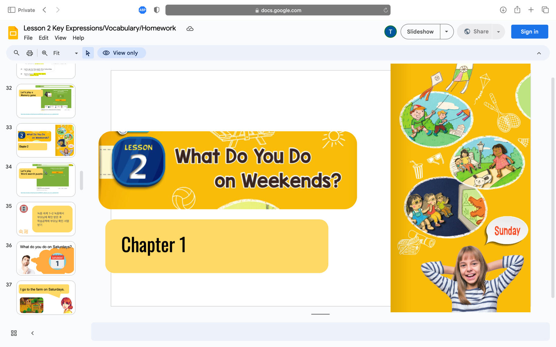
After lesson one, which consisted of six classes, we evaluated what was successful or not from students work and participation.We made the videos shorter and added more interesting activities, utilizing online word games to increase engagement. We also reduced student video submission homework, as too many students were having trouble. Here are links to the Google Slides for Lesson 1 and Lesson 2 so you can see how we adjusted the lessons after our evaluations.
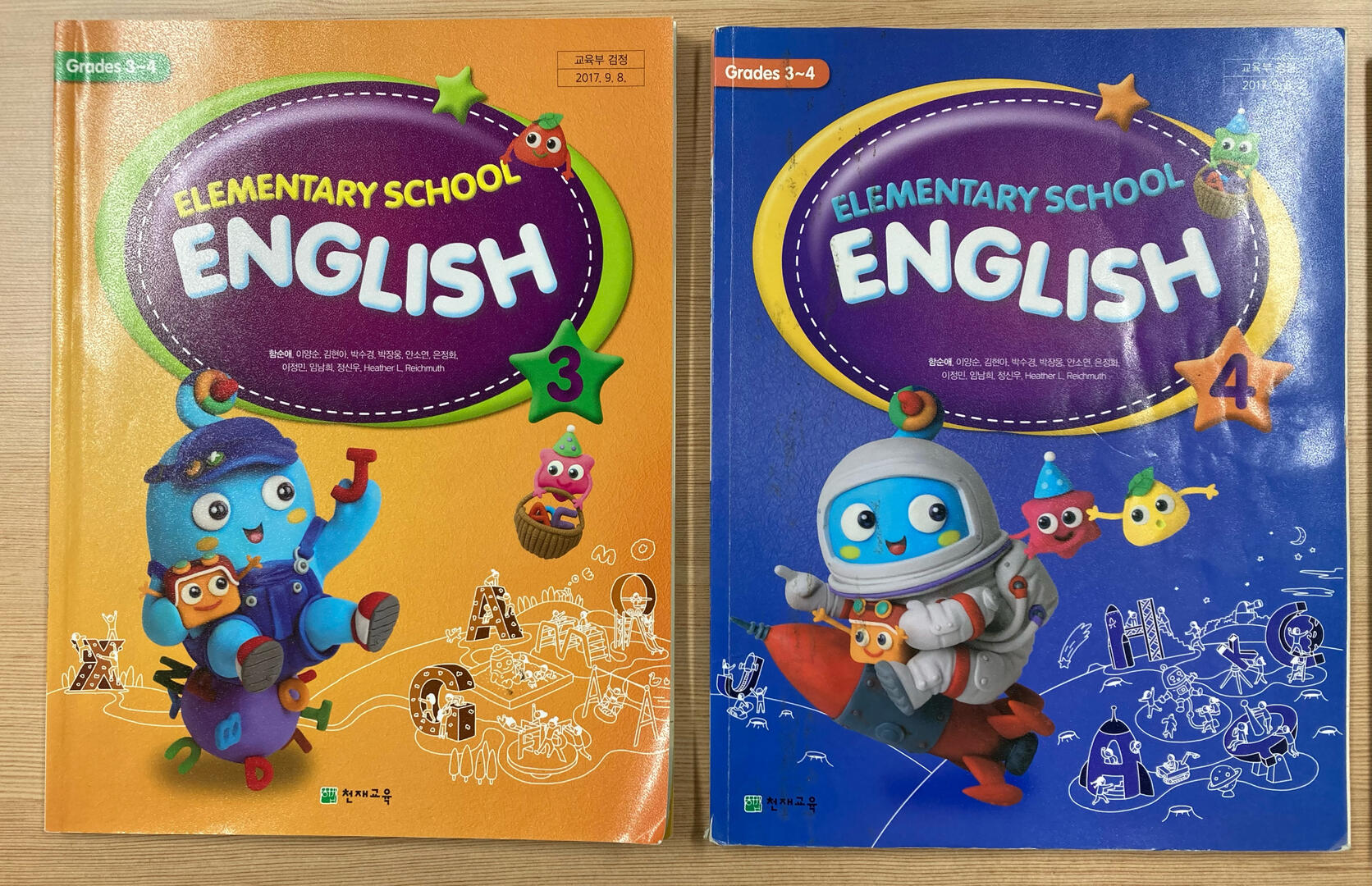
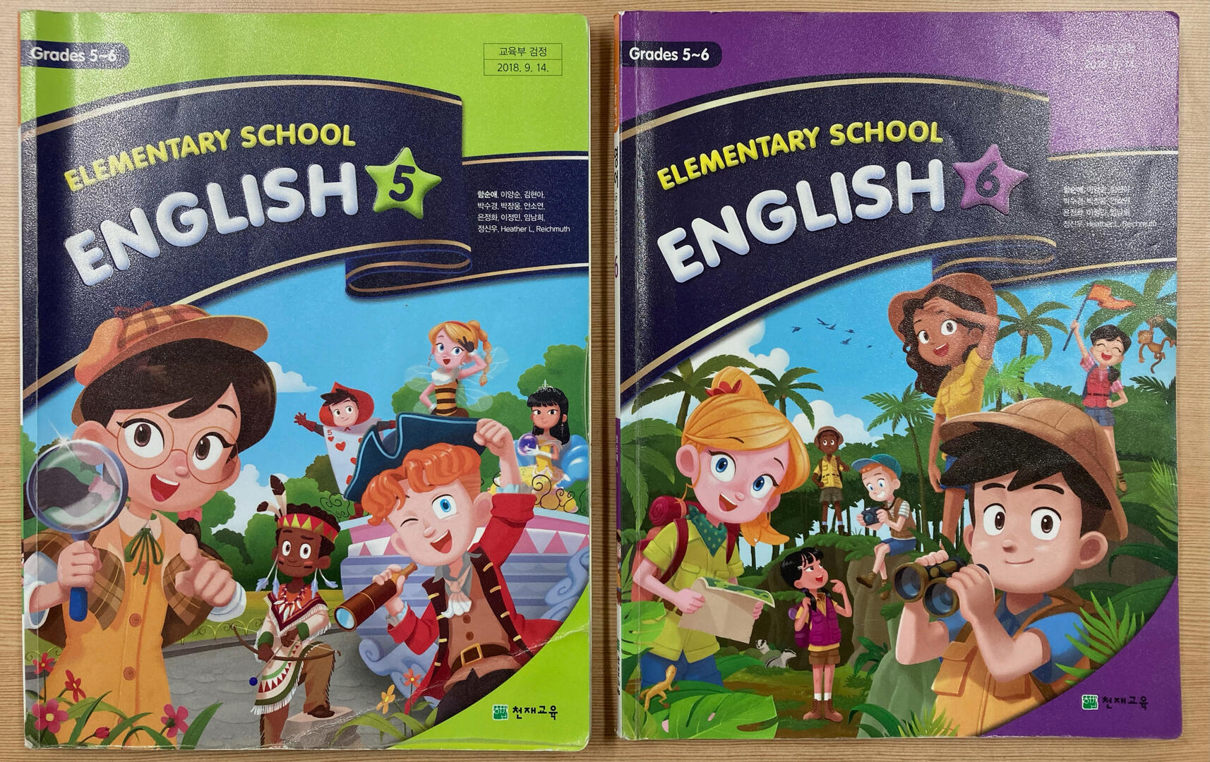
Students would submit their homework in the student interface section of the school's Learning Management System (LMS). The original LMS was very straightforward; it was just videos, pictures, and text submissions in both directions. Later, we switched to live conference calls (Zoom) and virtual classrooms that allowed live lessons with games and onscreen characters ( ZEP - Metaverse was the biggest one. Not Facebook Metaverse; it was a Korean application.) We would still use the old LMS to give students access to additional resources and for some homework assignments.All English lessons were based on the Cheonjae Elementary School English Textbooks, as shown below. The 5th grade lessons are based on the green textbook for 5th–6th grade.
Common Beneficial Predator and Parasitoid Insects in Montana's Crops
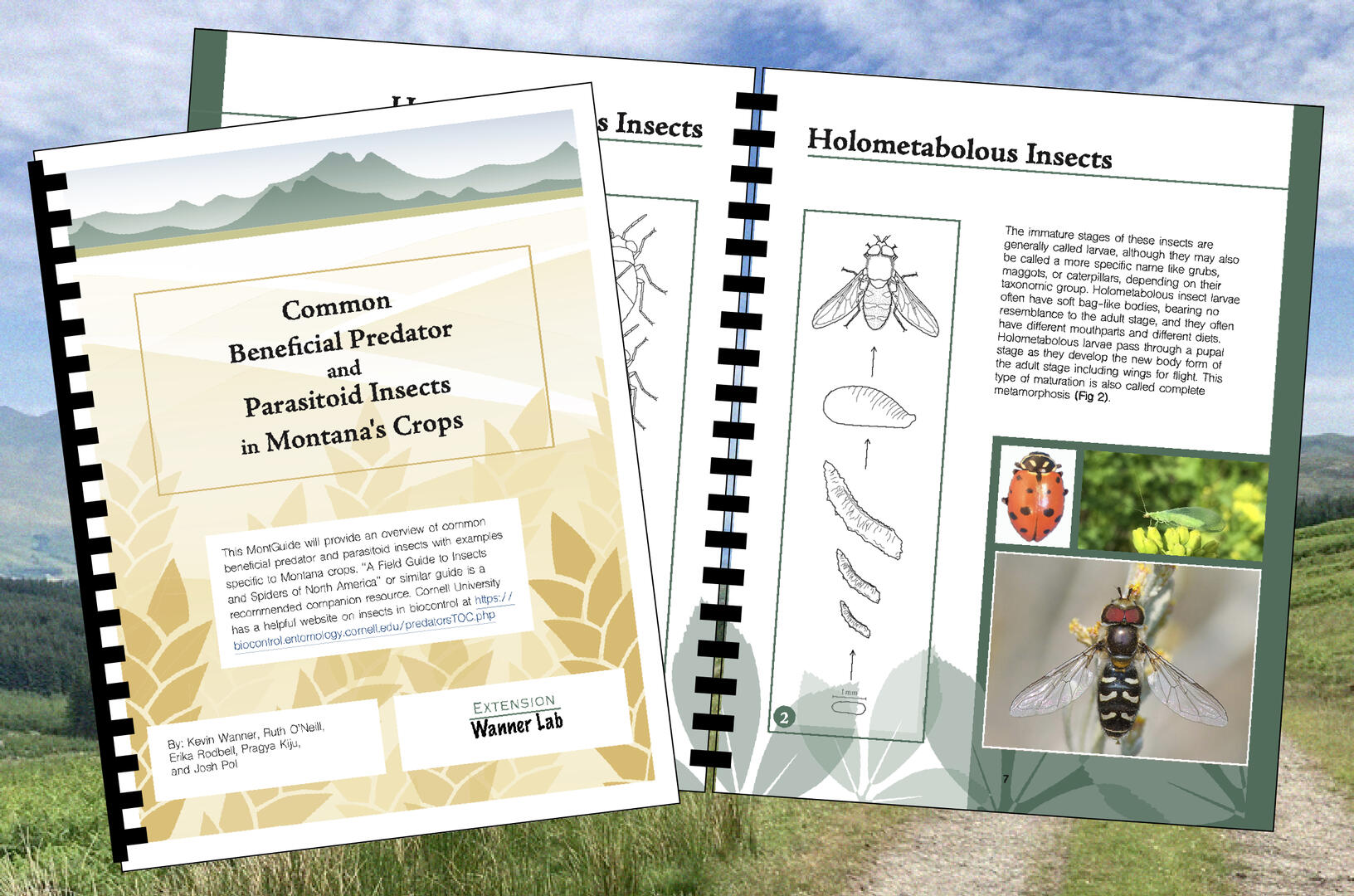
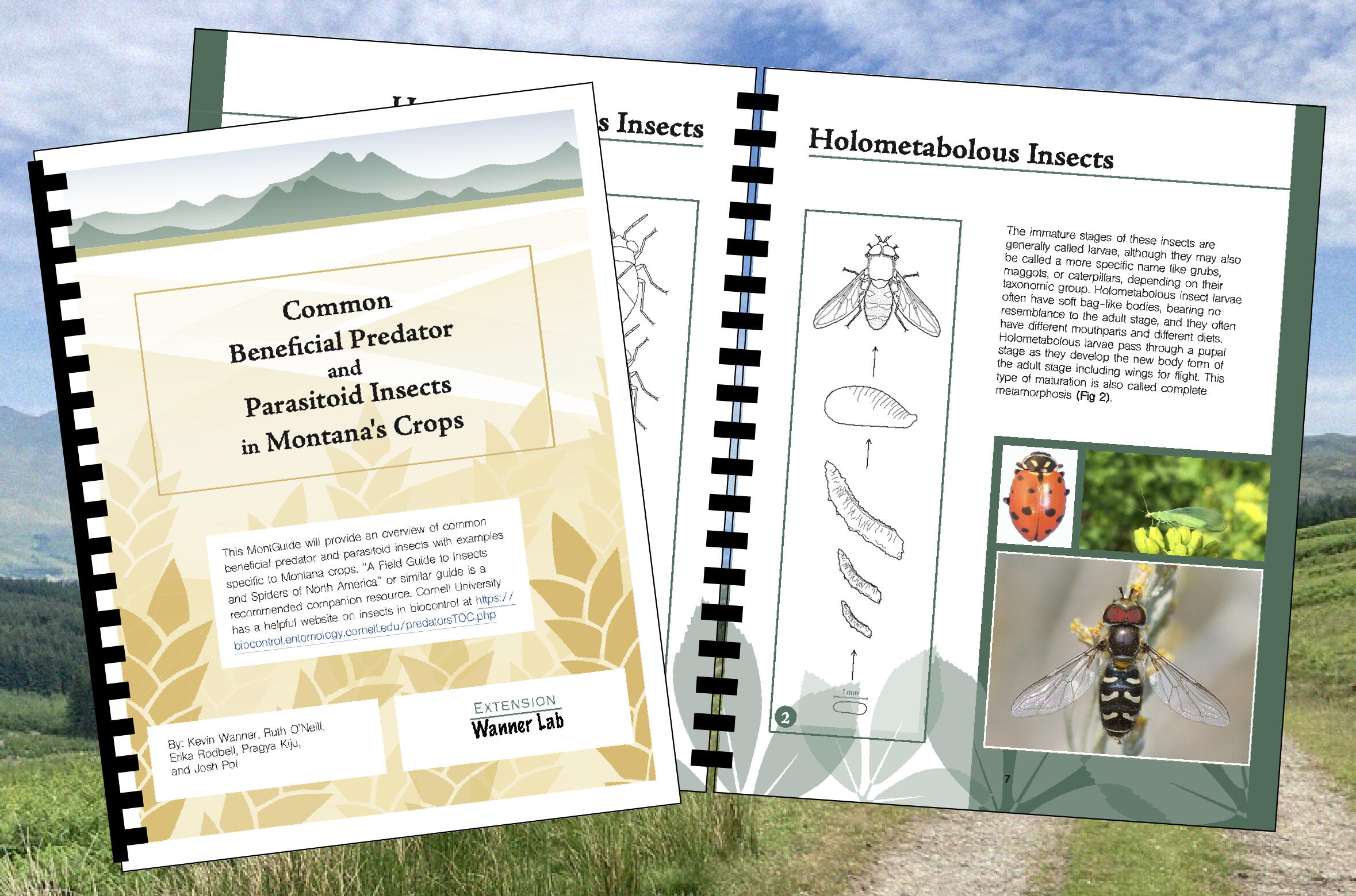
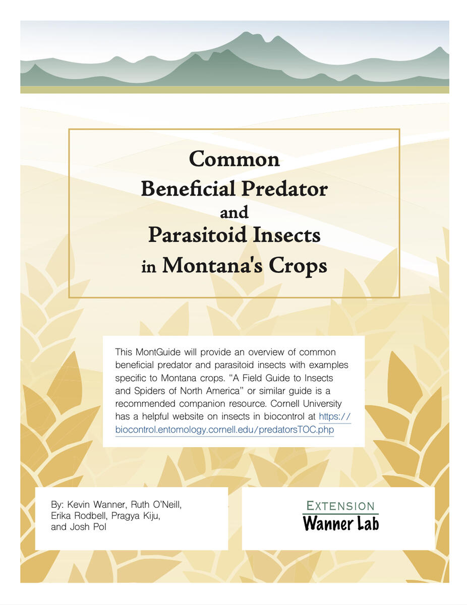
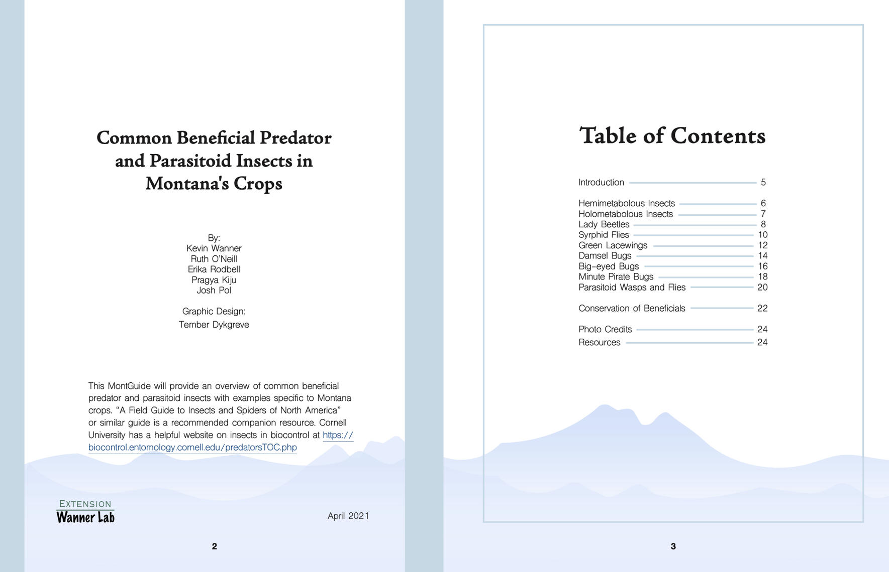
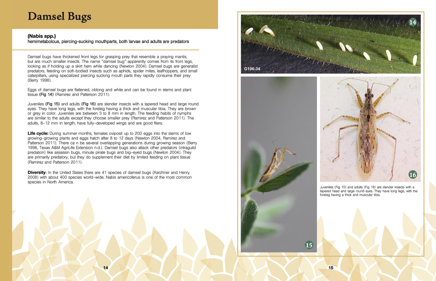
This was a deliverable for Montana State University's Crop and Pest Management School in 2021. The course, led by Kevin Wanner and Ruth O'Neill, was offered for pesticide application licensing credits. Unfortunately, due to COVID, the event was cancelled. The announcement is here.Pictures and copy were provided by Kevin Wanner and Ruth O'Neill. I chose the art direction and final layout, which were designed using InDesign, with additional assets made and edited in Illustrator and Photoshop. The insect growth stage illustrations were added to, rearranged, and vectorized to work within the manual. The original illustrations were made in collaboration with the lab.This 28-page guide was designed for print with comb binding and would be given to attendants of the course for use in lessons and for personal use. In the event of online dissemination I made a pdf version with clickable links. Some selected spreads from the guide are shown below.
Kevin and Ruth were interested in a clean art style for the guide. I interpreted that as having soft illustrative shapes, big images, and clean san-serif fonts.I designed the cover based on common Montana views: blue skies, mountains, and wheat fields. I later used each visual element listed above to visually separate sections of the manual.When given the manuscript, I identified three categories of pages: indexing and sources, overarching knowledge, and identifying insects. Combining this with the visual elements listed above, I created a template and color scheme for each section.Blue, for the skies, was used for all pages involving indexing and sources. Green, for the mountains, was used for all pages involving overarching knowledge. The majority of the book was yellow, for the wheat fields, and was used for all insect identification pages.A fourth color option could have been used to separate predator insects from parasitoid insects, but the parasitoid information covered only a single spread.A band of color is on the side of each page for quick reference. I personally love when manuals and guides color coordinate in this way, so why not mine?
RAW: Logo Development and Implementations
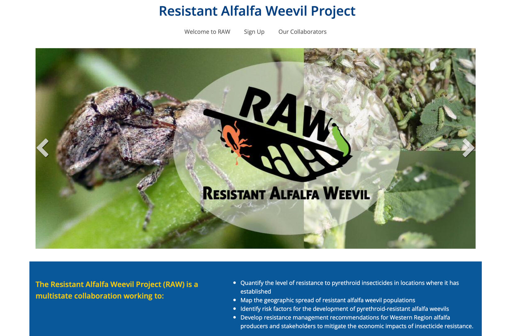
The Resistant Alfalfa Weevil Project, RAW, was a multistate research and extension collaboration to develop and deliver solutions to alfalfa stakeholders to mitigate the economic impact of insecticide-resistant weevils.In 2019, Kevin Wanner and Ian Grettenberger wanted a logo as well as print and web deliverables for their new grant-funded program. I worked as the graphic designer and scientific illustrator for the lab at the time, so I designed the logo, business cards, posters, flyers, PowerPoints, an extension website, and other miscellaneous extension materials using InDesign, Illustrator, Photoshop, and PowerPoint. Here is the RAW website.You can view the logo development in the slideshow below or in Google Slides.
Logo Implementation
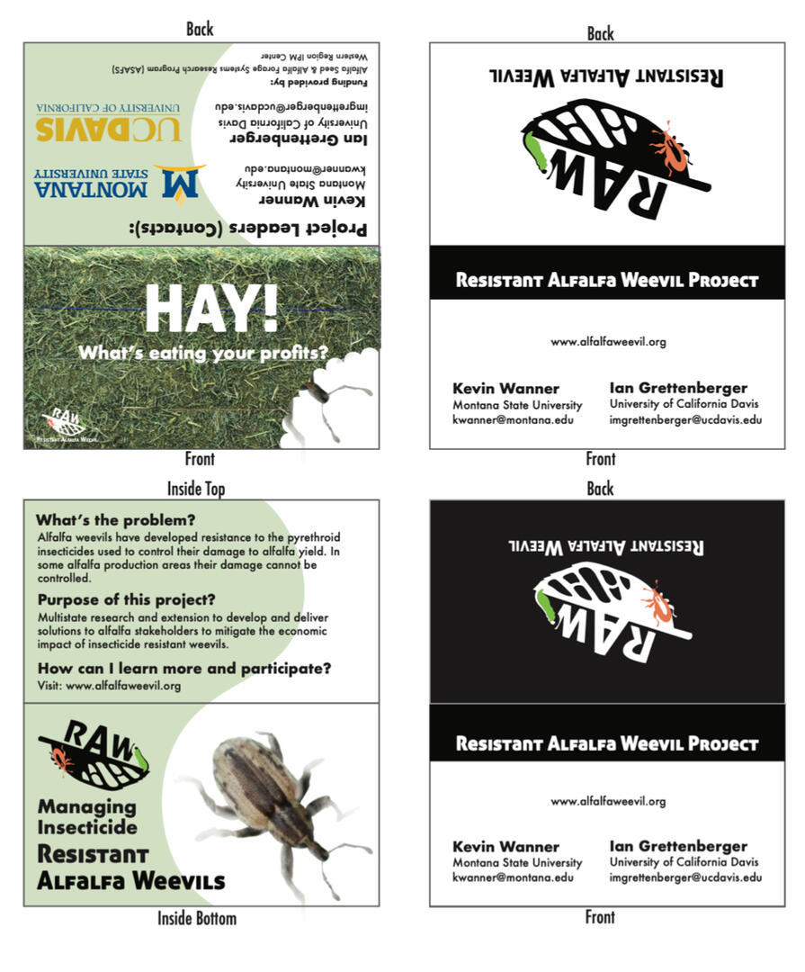
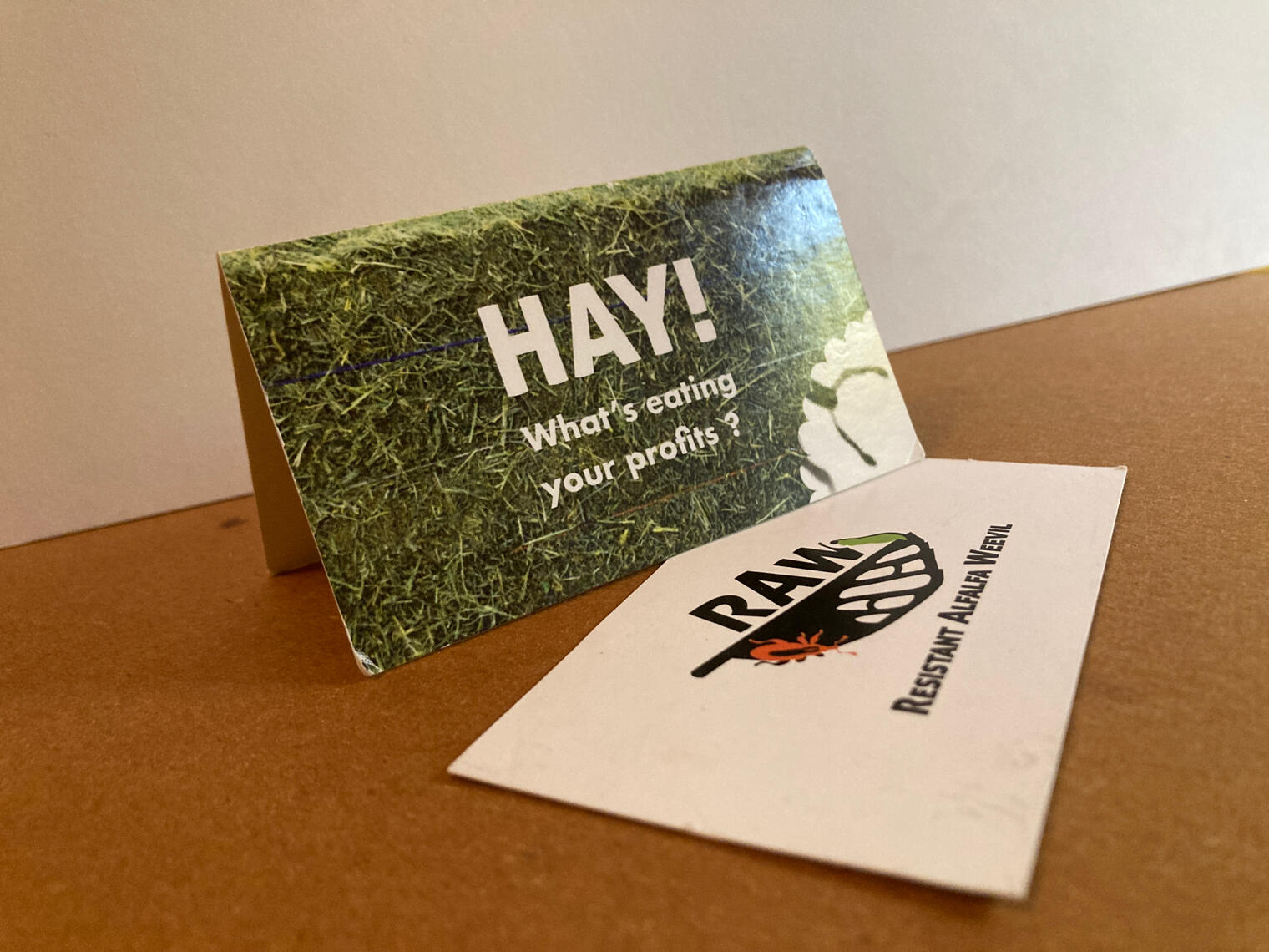
Business cards were made to hand out to possible participants. I designed the black and white business cards to be sleek and simple, catching the eye in contrast to the usual business cards seen at entomology conferences.
Professor Wanner came up with the idea for the folding business card, treating it as a small brochure. I made the card using Photoshop and Illustrator. It's a very fun business card! This set of business cards, pictured above, is very well loved, so please ignore the lack of crisp edges.
Ruth O'Neill used the RAW logo in the website banner below. I helped to set up the website and insert content, such as her banner, by taking certification courses on Montana State University's website content management system (CMS).After completing the courses, I was authorized to access and use Montana State University's CMS. I added all of Kevin and Ian's content, set up the website redirect, and published the website. Shared access to the website was granted to other researchers in both Kevin's and Ian's labs.In order to make the website as user-friendly as possible, I also took an optional course on website accessibility.
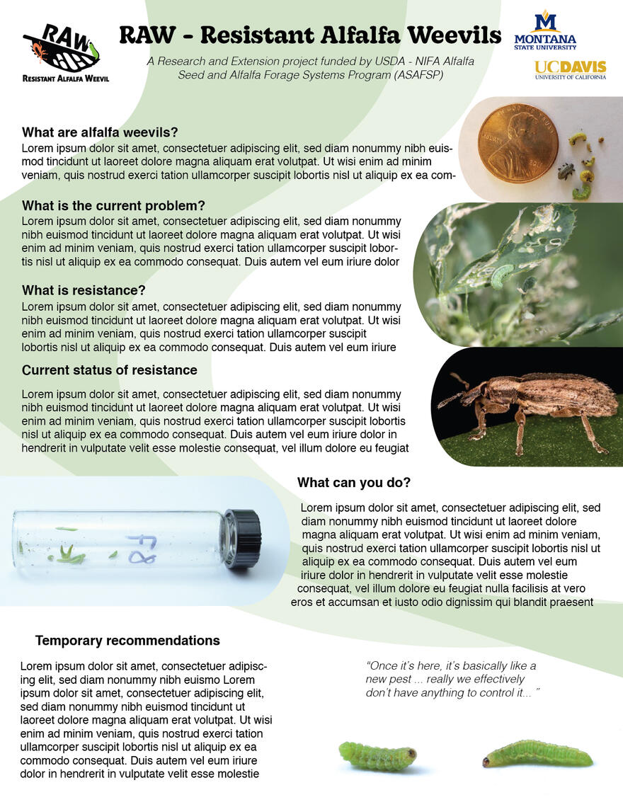
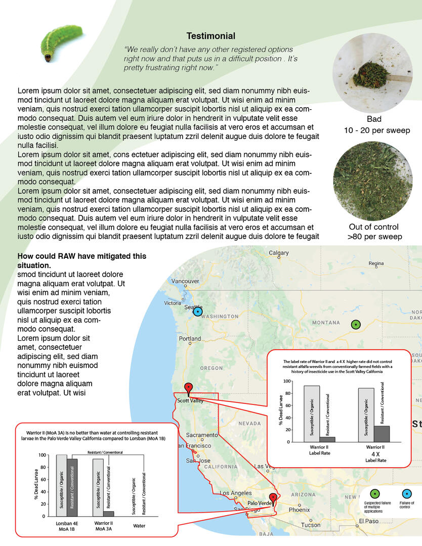
Flyers
Flyers were made to be placed where an alfalfa farmer might run across them. At the time, Professor Wanner only had the questions he knew he was going to answer, some images and test figures, and selected testimonial snippets. I designed the flyer template in Illustrator and sent him the raw documents so he could write the final copy when he was ready.
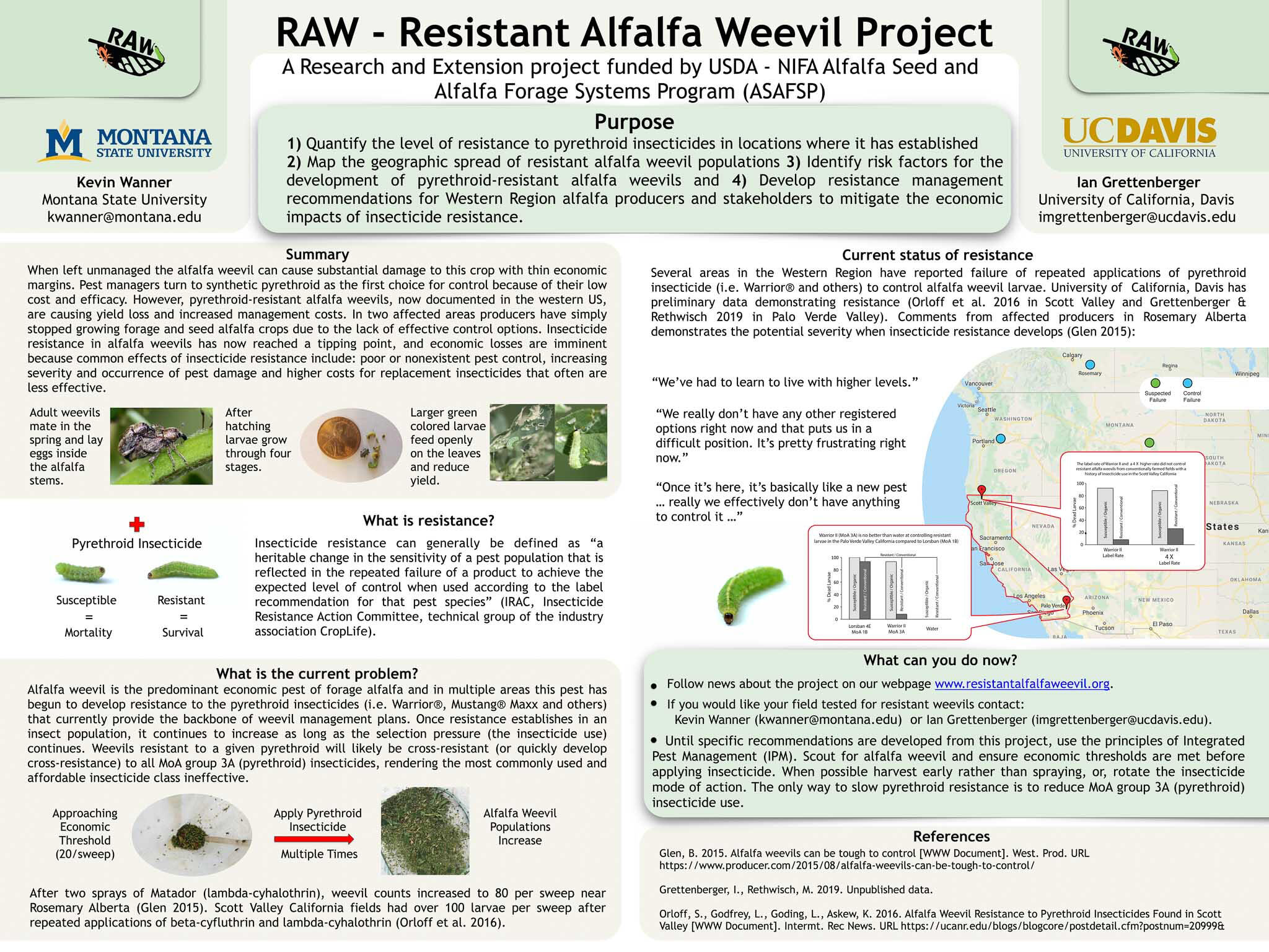
RAW - Resistent Alfalfa Weevil Project Poster
This poster was presented in Reno in 2020, and displayed during MSU extension courses. The text and images were provided by Kevin Wanner and Ian Grettenberger.I designed the poster in PowerPoint, with figures made in Photoshop and Illustrator.
Pestweb, An Area-Wide Real-Time Pest Monitoring System for Alfalfa Weevil
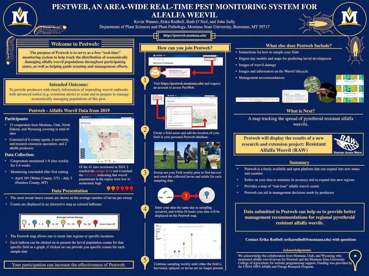
This poster, by Erika Rodbell, Ruth O'Neill, and John Sully, was made to promote PestWeb at a 2020 entomology conference in Reno. Pestweb's mission cross-pollinated with the RAW project, as shown in the rightmost column of the poster.Erika was the lead on art direction and final text. She picked the color scheme and outside column layouts. I made the inner column, insect illustrations, diagrams, and added a little zhuzh here and there.The inner column needed to show the process for joining and using Pestweb. I designed from experience as I documented all the steps I took to sign up for Pestweb, taking notes and screenshots along the way. Other elements were requested and added, like some nice shots of Professor Wanner sweeping an alfalfa field. On the Pestweb website an additional help page was added, reiterating the directions laid out in the inner column. Here is the help page.The poster was made in PowerPoint and Keynote, with illustrations and diagrams made in Photoshop and Illustrator.
A4ART: Logo Development and Implementations
A4ART: Advocates for Visual Arts is a non-profit that supports and promotes K-12 visual arts education in Gallatin Valley schools.I volunteered with the organization from 2019 to 2022 as the design and communications manager. I did multiple projects for the new organization, including, but not limited to: designing the logo, creating and designing the initial website (2020-2022), overseeing social media, and volunteering at events.While not all of my design work has made it into the future website, you can still see traces of my work at the official A4ART website advocates4art.org. All children's art was provided with enthusiastic consent from students and parents. Below is a slideshow containing the logo development process. Click on the arrows to scroll side to side.
The final logo rational and guidelines
The finalized logo was approved in 2019, with all logo variations provided for the organization in .png, .jpeg, .svg, and .ai files.The guideline document was made for future use of the logo as more people join the organization. All copy was written by me, with images made in Adobe Illustrator.The logo is still in use (2024). With the logo designed, I then moved on to creating a visual design style for the website.
Visual Development
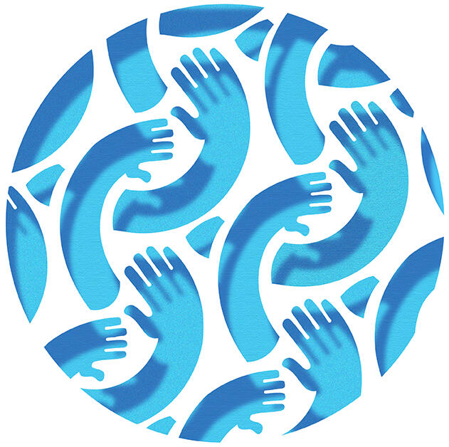
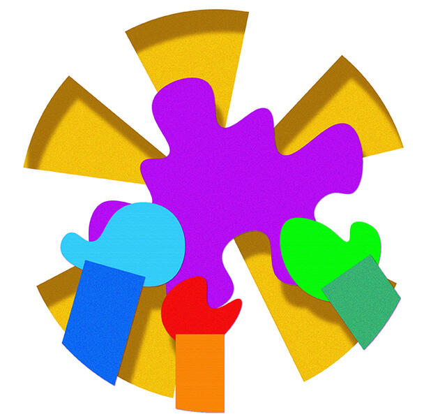
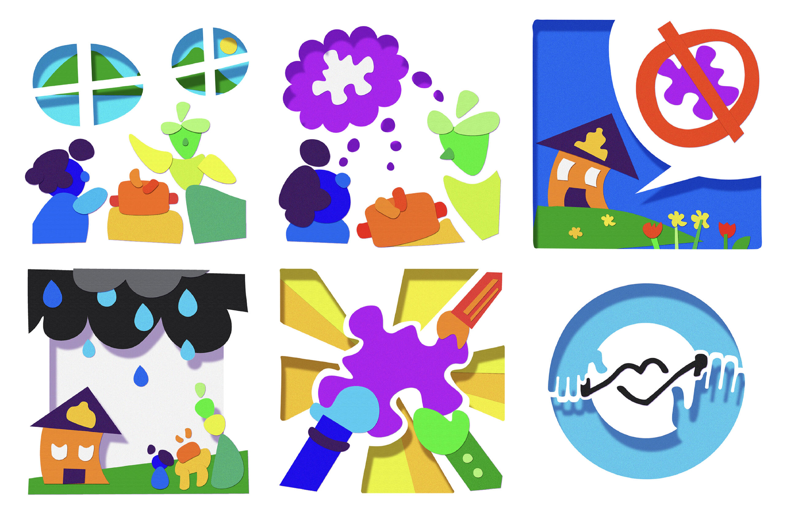
When developing the original visual style for the website, I took into account previous feedback from the logo design process. We knew that student art would be featured, but everything else besides the logo was up for change. A4ART wanted to differentiate itself from other art education organizations of the time, and I had some ideas.When looking at other art education non-profit organizations, I noticed an overwhelming use of paint as a design theme. While I loved the feel that the paint on the websites had, I couldn't help but want something that felt more physical, yet clean. And that's when inspiration struck: crafting paper. What if the website looked like it had paper glued to it? Or like it had holes cut through it? With a white background as a blank canvas, I could achieve both. The style tests proved exciting, and I knew it was time to put it into practice.
In Practice
After creating the website using Namecheap, Wordpress, and Elementor, it was time to start making assets. I created icons for website blurbs on community interaction and volunteering/donating.
I even created an illustrated comic for the organization's story. I tried to ensure that all the shapes were clean, yet they had just enough variation to look handmade. I used branding colors and common construction paper colors.Combining some of the children's art with the logo and cut-out styles, I made a banner for the website's homepage. Images on the website were often recessed into the page by using drop shadows in Photoshop.
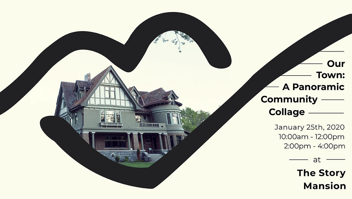
During feedback, the image that garnered the best response was the website header with the logo and children's art. The more subdued colors, refined cut-out shapes, and prominence of student art really resonated with the board. A more mellow aesthetic was desired, so I made adjustments accordingly.Pictured is a Facebook banner for an event A4ART was hosting in partnership with the Story Mansion. It explored a more subdued color palette and played with the drawn shape in the middle of the logo. This style was later folded into parts of the website and social media posts.Elements of the initial visualization remained, like the website header and the recessed pictures, but brighter images were removed for a more refined look.I agreed with all the changes, even as I mourned the loss of the comics. I still love this cut-out style and plan to explore it more in the future. Its main failing was the overly bright colors and the oversimplification of some shapes. Future exploration in this style, possibly with scrolling parallax, could create amazing results.
Setting up base: Maps and protocols
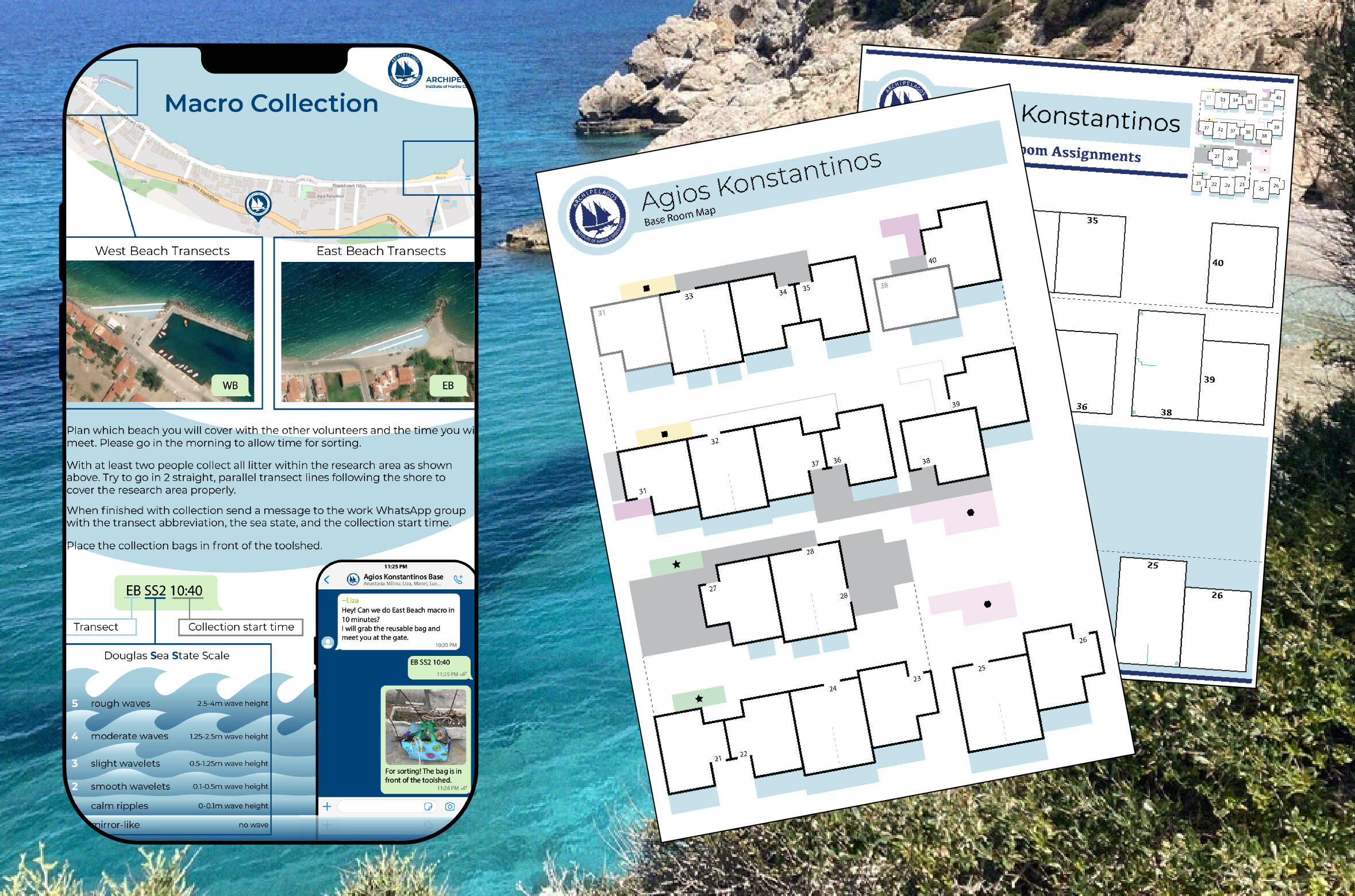
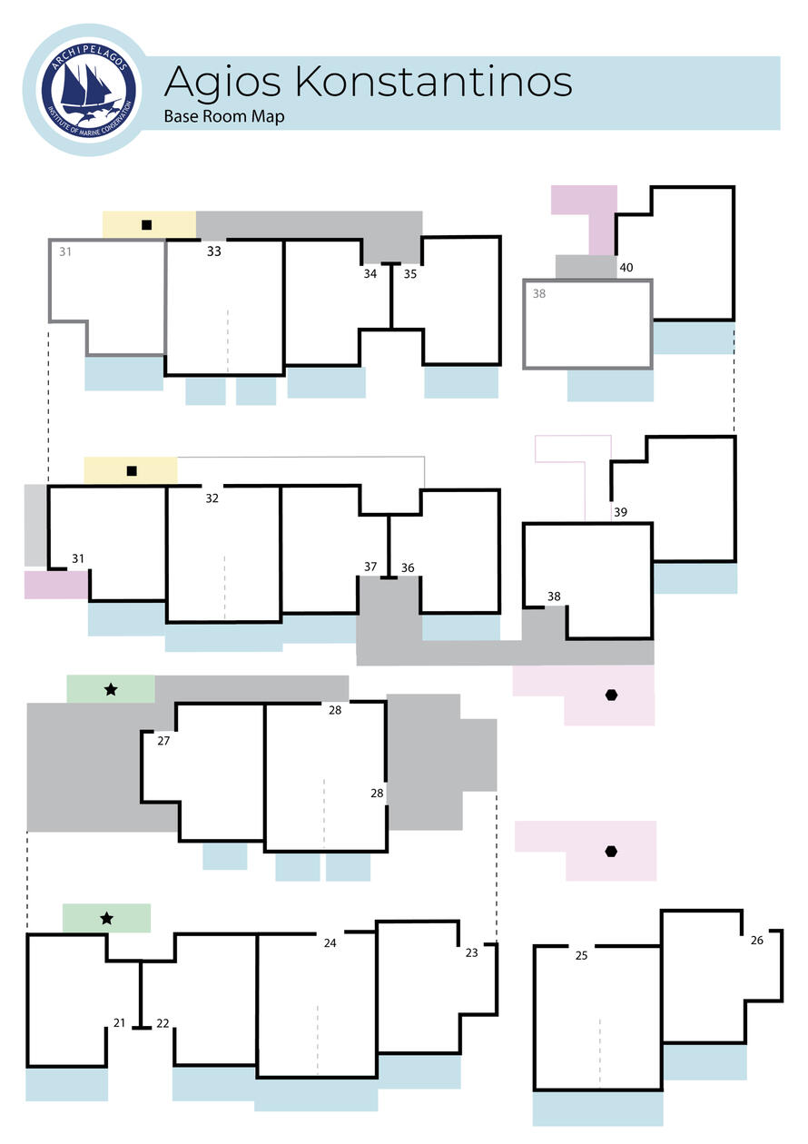
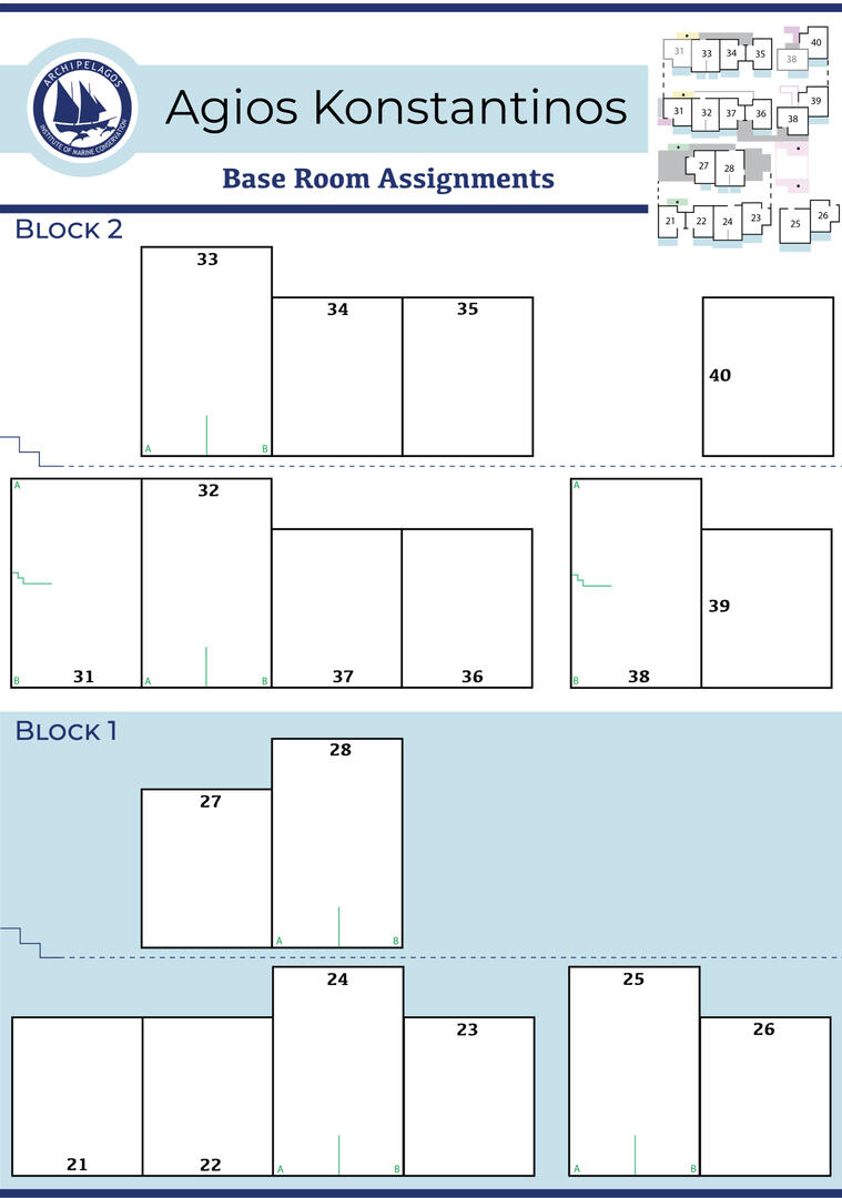
During my internship with the Archipelagos Institute of Marine Conservation (Archipelagos), I volunteered to go with the first set of researchers and interns to set up the new base in Agios Konstantinos. This was a highly anticipated event for the organization; they had been working for over a year to prepare. As the first group to live in the new base, we had a lot of organizing, planning, and cleaning to do before others could follow. While getting my hands dirty, I found a few additional projects that I could help out with.I made three documents for the new base: a simplified map for the complicated base layout; a further simplified map for room assignments; and a protocol infographic for current and incoming interns. All materials were made using the Archipelagos branding guidelines.
Maps
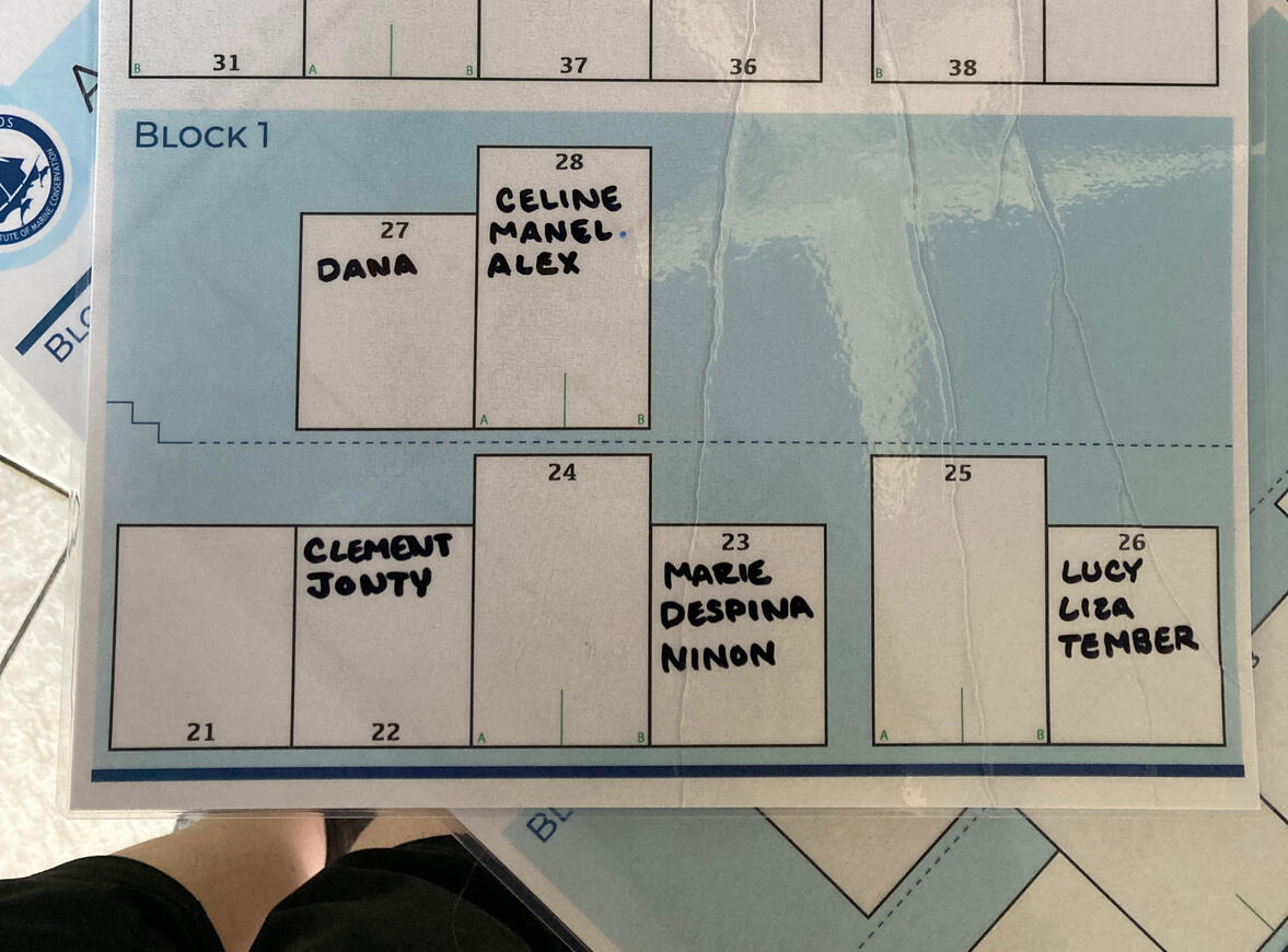
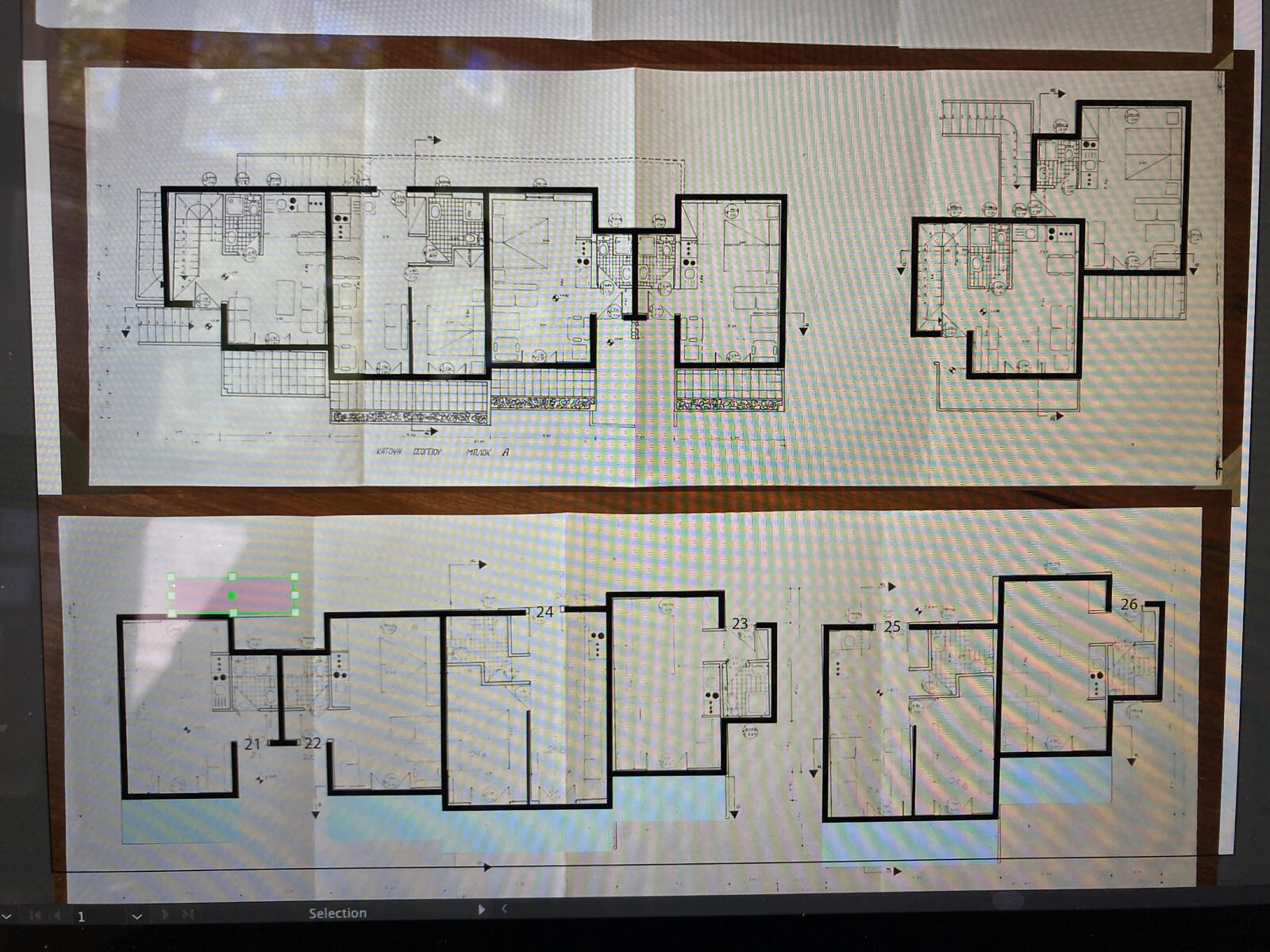
Due to the transient nature of the interns, visiting students, volunteers, and researchers, protocols and maps needed to be made sooner rather than later.The Base Room Map is a simplified version of the original floor plans of the hotel, and was made to quickly familiarize organization members and visitors with the complicated layout of stairways leading up the base's hill. At its inception, this map kept track of room preparation progress, showed the number of working keys per room, and helped interns and volunteers keep a common and ongoing list of necessary changes and supplies. Currently, the final map is displayed in the meeting room to help visitors and members of the organization, with a labeled map key added for better image clarification (key not pictured).Later, when interns and students started moving into the base en-masse, a room assignment map with space for writing names was needed.The Base Room Assignments map simplified the original map further, turning the rooms into larger rectangles to allow space for writing. Key identifying information, such as relative location, doorway location, room numbers, and room floors, was subtly added. A miniature "Base Room Map" was added in the upper right to help with the stairs, if needed. The wild, wild stairs.Both maps were designed to be printed on A3 paper and laminated. A backup set of documents was made, splitting the map into two A4 sheets of paper for easy combination in a pinch.
The Process
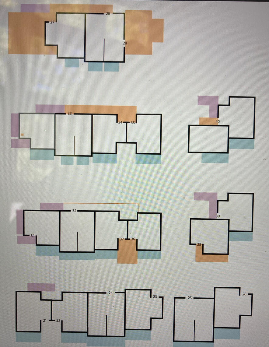
First, I laid out all the floor plans in the correct order and took pictures. Next, I took the pictures into Illustrator and traced the room outlines, balconies, and staircases. Similar structural elements were color coordinated, and room numbers were inserted in the doorways. I then tested the map for accuracy and ease.
I went on a walk with the rough draft (the orange and pink map pictured above) to check that all the rooms were placed correctly. The first walk-through wasn’t perfect: parts of the map were mixed around, and the layout for second-story rooms wasn’t intuitive. This was the first test of the map, with more to follow.When personally checking keys, a seemingly never-ending task, I would take notes on my phone on how to make the map better. I would then ask others to go check keys for me, giving them the newly adjusted map and sending them off to the far reaches of the base. Most returned alright, and their feedback was invaluable. After the map was tested and approved, it was laminated for repeated use and kept digitally for Archipelagos needs.
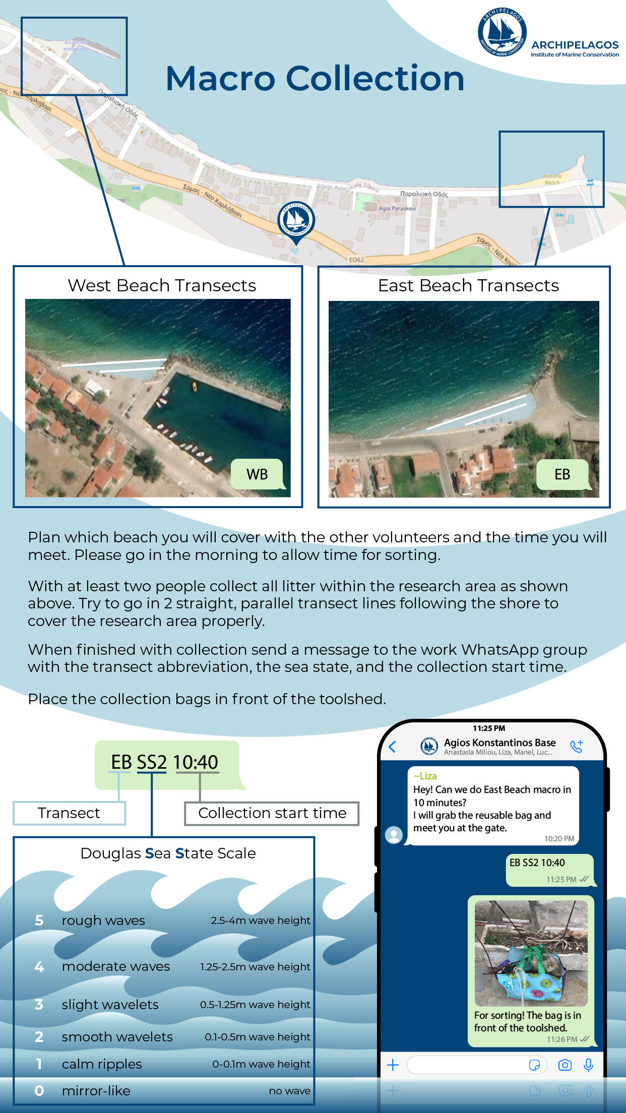
Macro Collection Protocol infographic
With a steady stream of in-and-out interns, the confusion regarding the new base’s macro-plastic collection protocol was starting to affect the quality of data. The newness of the protocol, paired with the differing disciplines and nationalities of interns, was leading to minor communication breakdowns. I decided it was time to work some documentation magic.All Archipelagos base's documents are accessed using the work WhatsApp's document section. Designing the infographic with this in mind, I picked a layout for phones, allowing easy image downloading and viewing while out in the field.After picking the format, I started to gather information. I compiled a list of the most common questions and answers I had overheard during morning meetings, and I interviewed the main supervisors about common mistakes, etiquette, and their ideal protocol guideline. I took this information and broke it down into sections, deciding which format (image, text, graphic, etc.) would be the most clear and efficient per section.Using ArcGIS, I took images of the two transect areas, East Beach and West Beach, and the street map spanning between them, base included. The Archipelagos logo marks the base, the blue overlays on each beach are the research areas, and the white lines are the transects.Next, I wrote the protocol process for collection, with expected etiquette included. Teams had to coordinate daily, so having the rules and expectations plainly stated helped to keep peace on the base. The WhatsApp text formatting, which was made to help input accurate data, was explained and modeled throughout the whole document.Finally, I created a Douglas Sea State Scale visualization using the official descriptions and insights from other researchers and interns. For a couple days, I would point at the ocean and compare my rating with that of someone who knew better, which helped inform the final design. This image was helpful for the other multidisciplinary interns who had no prior experience with the scale, as reference images are hard to find.After a couple of intern tests and supervisor revisions, the protocol was finished and put in Archipelagos’s WhatsApp documents. The documentation magic worked, as morning meetings no longer had protocol questions.
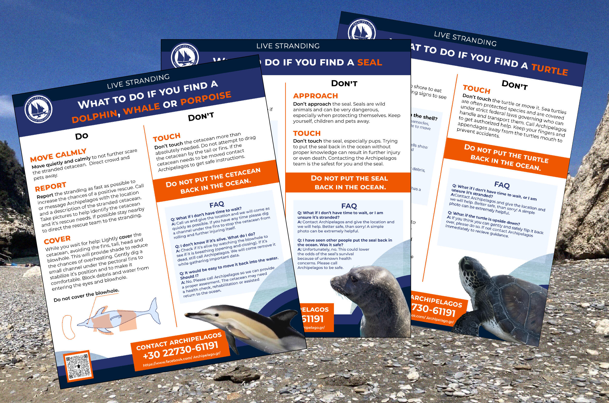
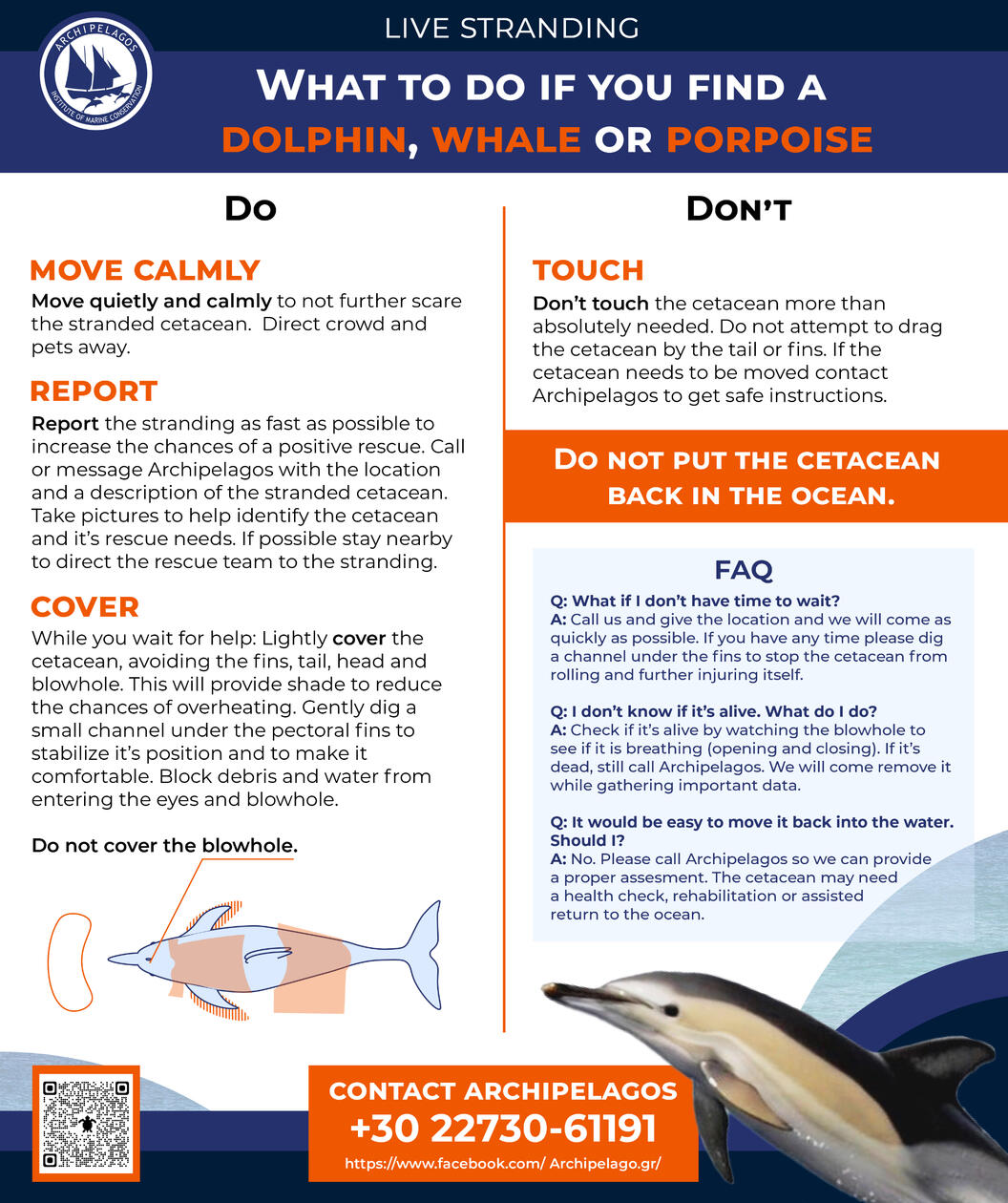
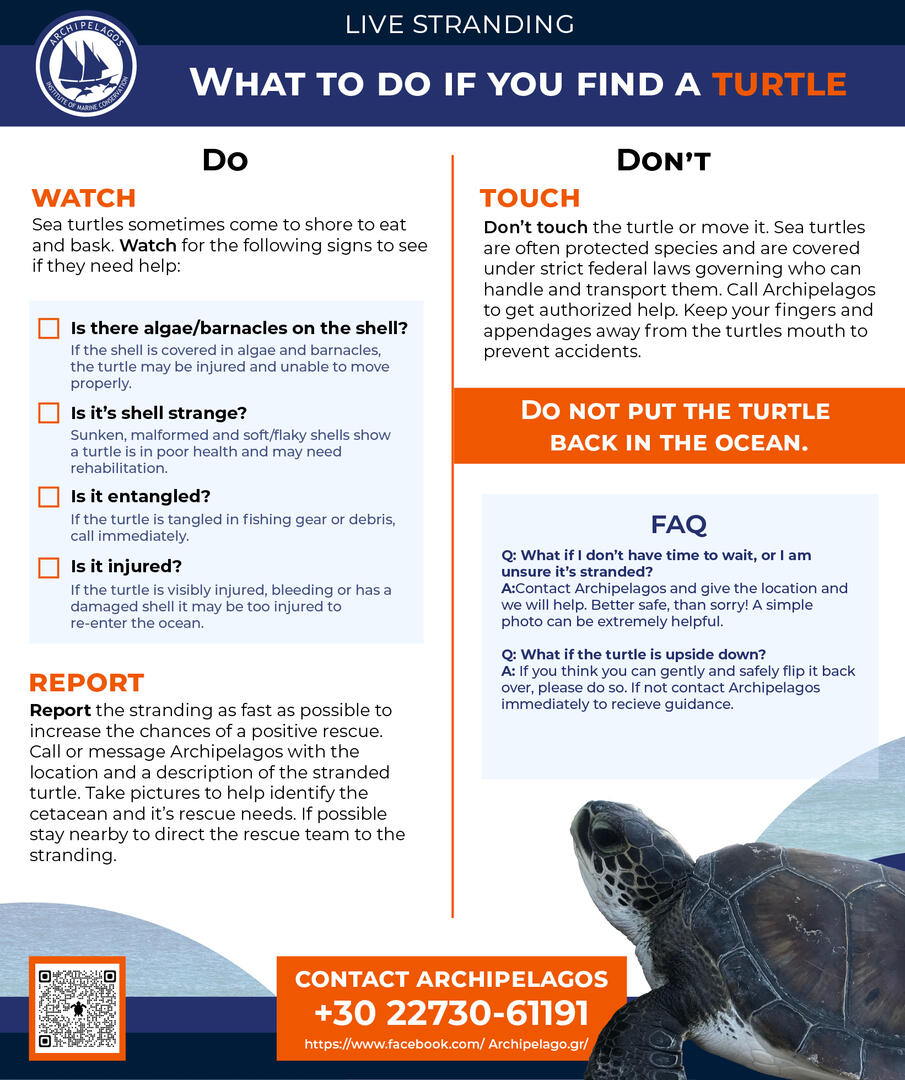
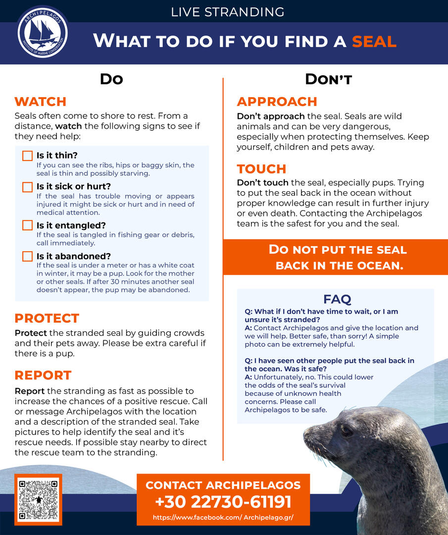
Live stranding Facebook posters
A series of three educational Facebook posts informing Samos occupants what to do and what not to do in the event of a live stranding. The posters were made for the Archipelagos Institute of Marine Conservation's Facebook page, which had the highest community engagement of the organization’s social media, to encourage the community to share, print, and post this possibly life-saving information near beaches, especially in tourist areas.Selected groups of marine animals and reptiles (cetaceans, seals, and turtles) were chosen based on data from live strandings reported on the island. The original live stranding information was gathered by Lisa, an education intern, for lesson development. After reviewing her research, and seeing all the identified public misinformation, our supervisors decided to combat live stranding misinformation on the island as a whole. How to do this was torn between two options: making Facebook posts or making printed posters. The final decision landed on a combination of both. I took on the project to create the final posters.The posters were designed using the current (2023) Archipelagos branding guidelines in Illustrator. They were tested for black-and-white printing to ensure legibility if color printing was not available. Final deliverables were saved in .pdf, .png, and .jpeg forms, with templates made and saved in Illustrator, InDesign, Powerpoint, and Google Slides.
I distilled the information Lisa gathered down to the main do’s and don’ts for each group. To further clarify, I interviewed some of the researchers and staff to fill information gaps (e.g., How do you cover dolphins? Do you wet the material you cover them with? What are some common mistakes you have seen during or after live strandings?). I tried to ensure that every do and don’t was explained so that people understood why they were taking certain actions. If people know why, they can make better decisions based on their unique situation.Covering stranded dolphins was a major point of confusion, so I chose to add an illustration that showed some essential information quickly and easily; after all, who knows if beachgoers will remember dolphin anatomy like pectoral fins and blowholes? The dolphin illustration was made in collaboration with Leah, a media intern.I submitted the original copy and layout for approval from the media supervisor and head of the organization. This went back and forth, with language being adjusted for casual levels of understanding. A FAQ was added to each poster to cover common concerns or misconceptions that people might have in a gentle conversational manner.
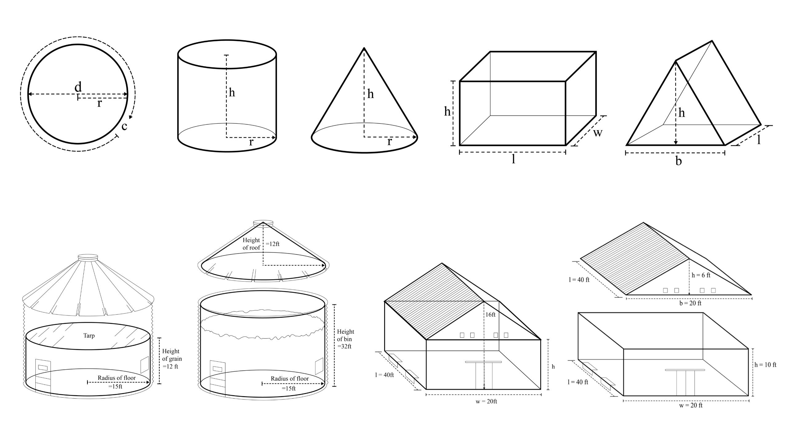
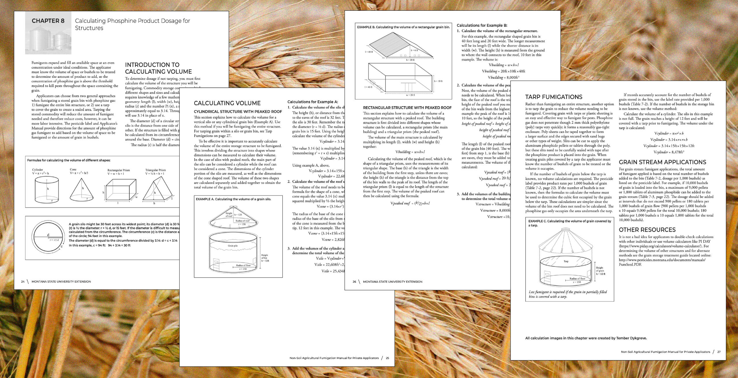
Fumigation calculation images
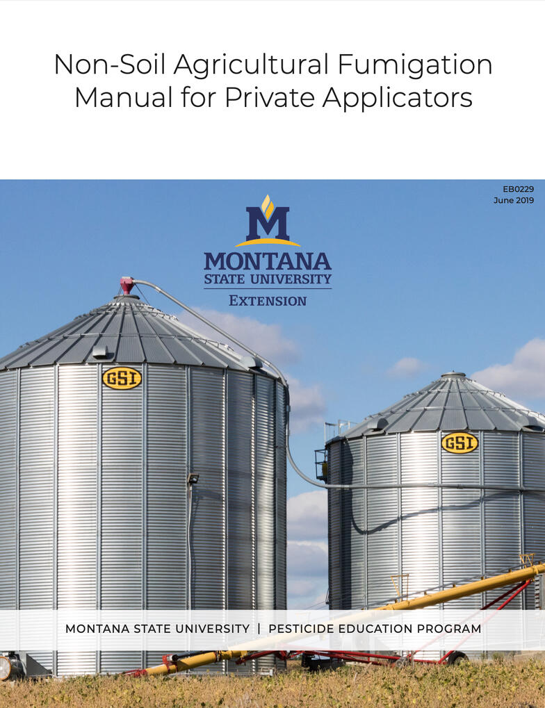
A series of diagrams to refresh private applicators on how to calculate the volume of storage structures. These diagrams were created for a Montana State University Extension pesticide education program manual titled "Non-Soil Agricultural Fumigation Manual for Private Applicators".The diagrams are featured from page 24 to page 27. All diagrams were created using Illustrator. To view the full pdf of the manual, click the image below.
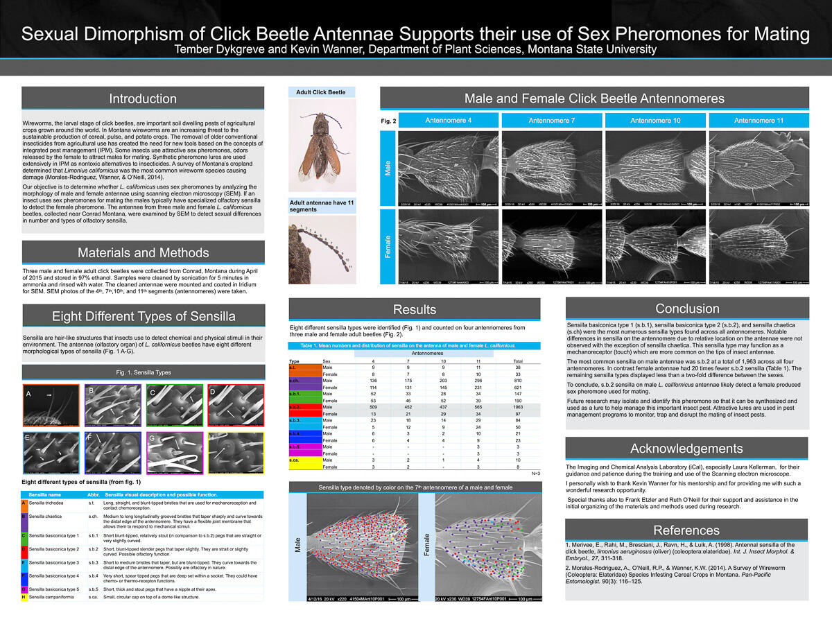
Sexual Dimorphism of Click Beetle Antennae Support their use of Sex Pheromones for Mating
A poster summarizing my mentor-led personal research project on sexual dimorphism in Click Beetle (Limonius californicus) antenna.The final poster was presented in the 2016 Montana State University Research Celebration, with research being funded through the Presidential Emerging Scholars Grant. The grant was awarded for use of the scanning electron microscope, with additional hope of adding DNA sequencing to flesh out the project for possible publication.Unfortunately, we were unable to collect enough insects for viable DNA sequencing within the grant's timeline constraints; however, the project has created the foundation for future undergraduate research projects. The grant and mentor-led research opportunity were such positive influences in my life, and I am forever grateful to the donors, Kevin Wanner, and Ruth O'Neill.This project was a long and involved process. Parts of the beginning research exploration can be seen in the PowerPoint, with the addition of some photos of the Research Celebration and Emerging Scholars award ceremony. I completed training for the SEM with the iCAL facility at Montana State University.A copy of the labeling system I created for photos and research notes remains with the lab.All scans were taken by me, with figures created in Photoshop, Illustrator, and PowerPoint. All text was written with the supervision of my mentor, Kevin Wanner.
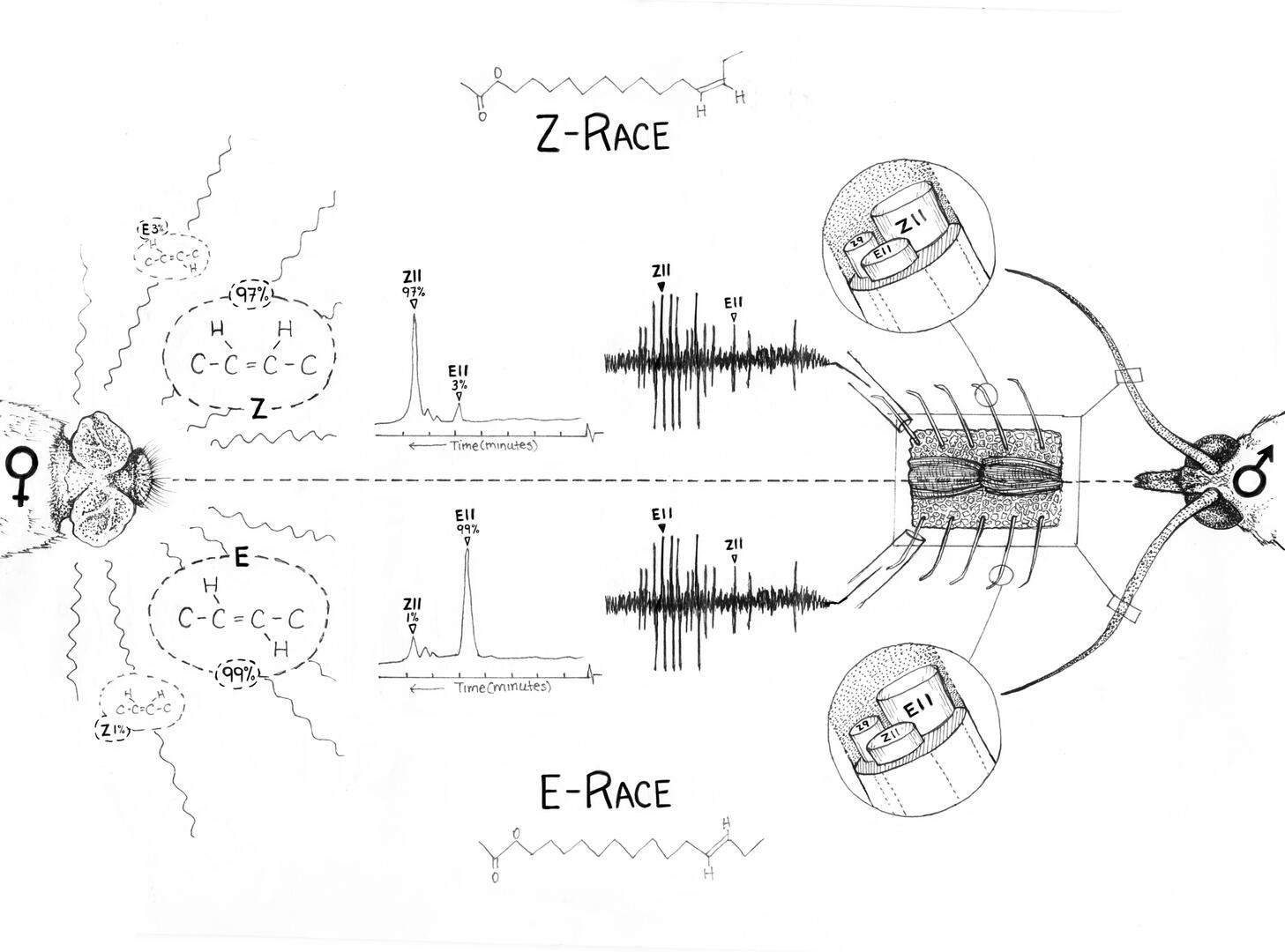
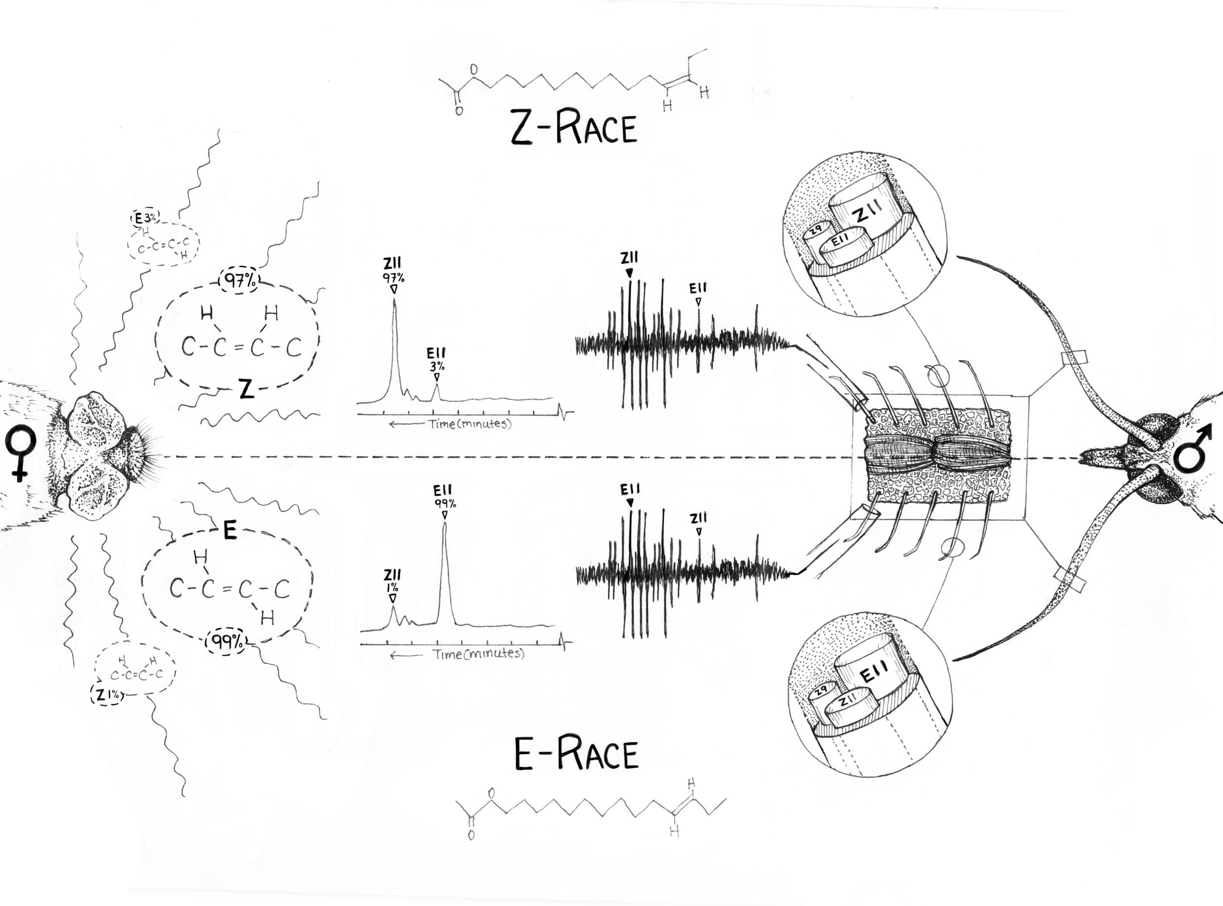
European corn borer E- and Z-race pheromone communication channels
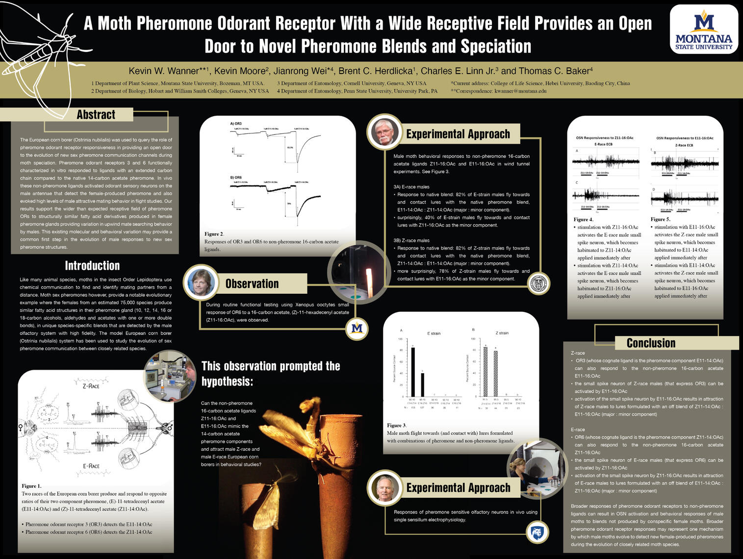
This was a two-part project: a graphical abstract and a conference poster. Pictured is the graphical abstract for the conference poster titled, "Moth Pheromone Odorant Receptor With a Wide Receptive Field Provides an Open Door to Novel Pheromone Blends and Speciation." The poster was made for the European Symposium of Insect Taste and Olfaction (ESITO). You can see the poster below.At the initial design meeting, Professor Wanner described his research and what he wished to convey with the abstract: a side-by-side comparison of selected e- and z-race pheromone odorant receptor research. During this meeting, we planned a couple of layouts and picked the final layout for its efficiency. Professor Wanner wanted a more traditional ink-drawn style for this illustration. He provided images, graphs, and mating videos of the European corn borer (Ostrinia nubilalis) for reference.The finished ink drawing was done using Micron pens and scanned, with clean-up done in Photoshop. The piece underwent two more sessions of feedback, with final approval granted for placement in the poster.
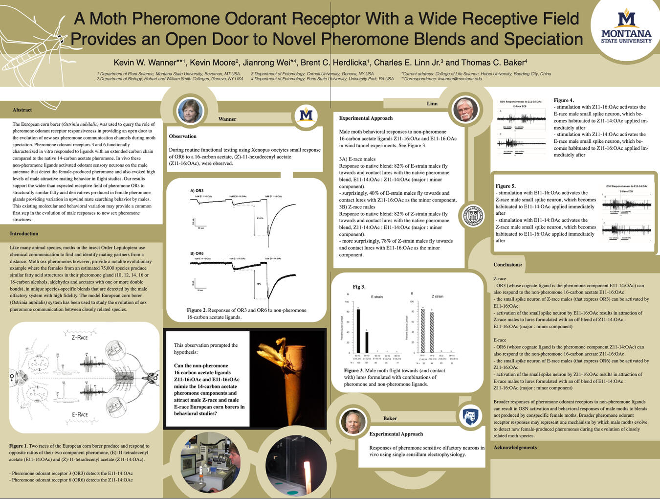
A Moth Pheromone Odorant Receptor With a Wide Receptive Field Provides an Open Door to Novel Pheromone Blends and Speciation
Professor Wanner and his collaborators provided a series of documents containing the text, layout order, and multiple images they wished to include. I laid out the rest of the poster using InDesign and Illustrator. The completed illustration of the graphical abstract, seen in detail above, is Figure 1.The all-yellow original draft is below. It was too busy, with design elements that disturbed the visual hierarchy, and made information unclear.During the redesign, I took inspiration from the wind tunnel photos (my personal favorites). The poster background was changed to black, allowing the European corn borer photos to really shine. The background change encouraged other design changes that resulted in a clearer visual hierarchy, more interesting photos, and a cleaner look.
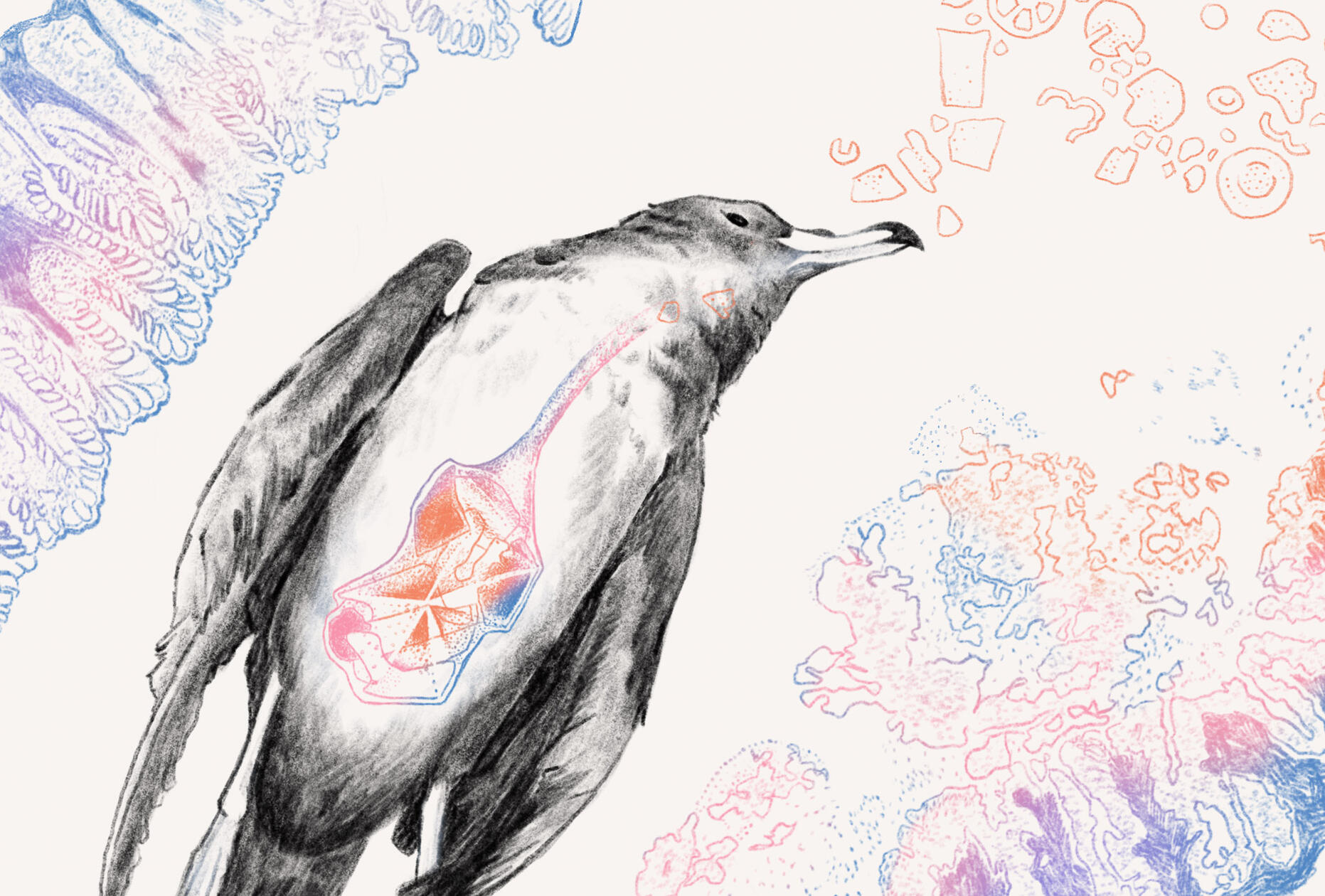
Plasticosis in Flesh-footed Shearwater fledgling
This is an editorial image exploring a hand-drawn style inspired by Arcadia Science. It's based on recent research on macro- and microplastic-associated fibrosis in Flesh-footed Shearwater (Ardenna carneipes) fledglings' stomach tissue. The article coined the term 'plasticosis' for the plastic-induced fibrotic disease (Charlton-Howard et al., 2023).After reading the article, I sourced multiple reference images of fledging necropsies, seabird anatomy, Flesh-footed Shearwaters, Flesh-footed Shearwater fledglings, and the Masson’s trichrome image results from the article for the illustration. After exploring multiple layouts, I created the final piece using Procreate and Photoshop.The dead fledgling is posed on its back with an unnaturally distended stomach. Orange plastic shapes --based on plastic removed from fledglings' stomachs during necropsies-- float towards the fledgling's mouth.The Masson's trichrome result from a healthy stomach tissue sample is in the upper left in pink and blue. The damaged stomach tissue is on the bottom right. The plastic orange color seeps into the unhealthy sample's colors, implying plastic's part in damaging the once healthy tissue.
Charlton-Howard, H. S., Bond, A. L., Rivers-Auty, J., & Lavers, J. L. (2023). “Plasticosis”: Characterising macro- and microplastic-associated fibrosis in seabird tissues. Journal of Hazardous Materials, 450, 131090. https://doi.org/10.1016/j.jhazmat.2023.131090
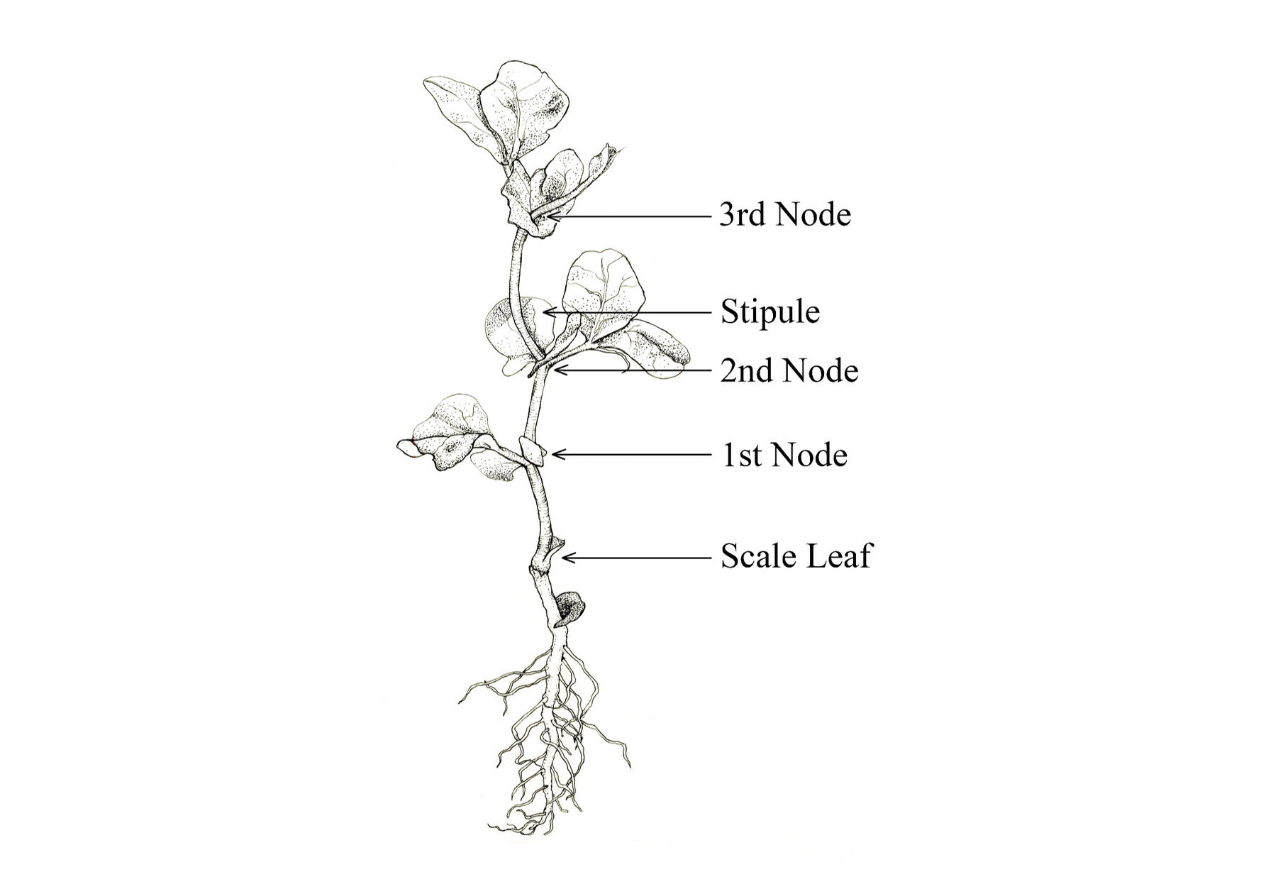
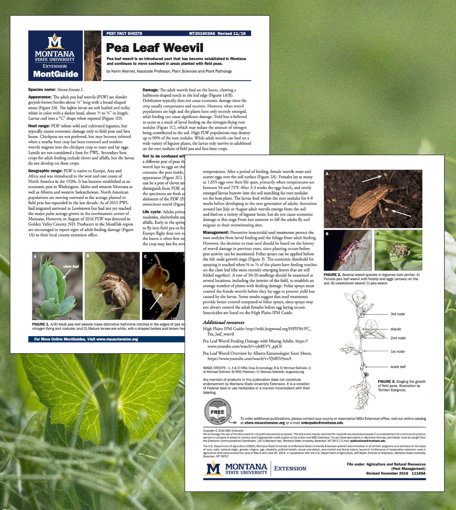
Staging the growth of field peas
A scientific illustration I did for the Montana State University Extension Wanner Lab. Professor Wanner asked for an illustration of the growth stages of field peas for a short article on Pea leaf weevils (Sitona lineatus).He brought in a fresh pea plant sample for initial reference photos and illustrations. I submitted a couple rough pencil layout sketches for approval, from which he picked this one. The final illustration was inked with Micron pens, scanned, and then cleaned in Photoshop. It was sent to Professor Wanner for labeling and insertion into the final document.The online MontGuide Publication is here.
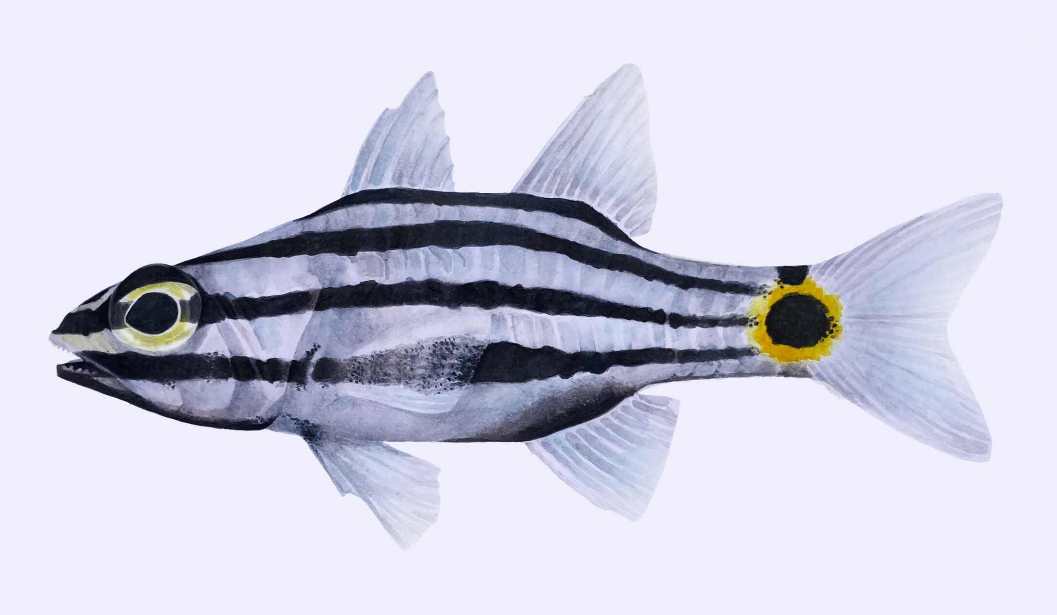
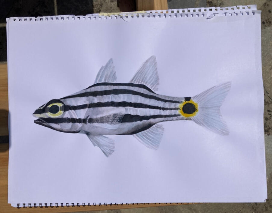
Identification of the Indian Ocean twospot cardinalfish
This illustration was made for the Archipelagos Institute of Marine Conservation to use in future ID posters, guides, and presentations on invasive species of the Aegean Sea. I was assigned the Indian Ocean twospot cardinalfish (Cheilodipterus novemstriatus), one of the missing species from the ongoing invasive species illustration database.I used online resources to get an understanding of the key identification points of the species. After sorting through Archipelagos's image and video databases for more visual references, I did an initial pencil illustration of the fish. You can see parts of the illustration process below.This final piece was painted with watercolors and edited with Photoshop and Procreate.
The Process
The initial research was compiled in a Google Slide presentation. I like to use Google Slides when working with groups because of the easy and instant online sharing function.
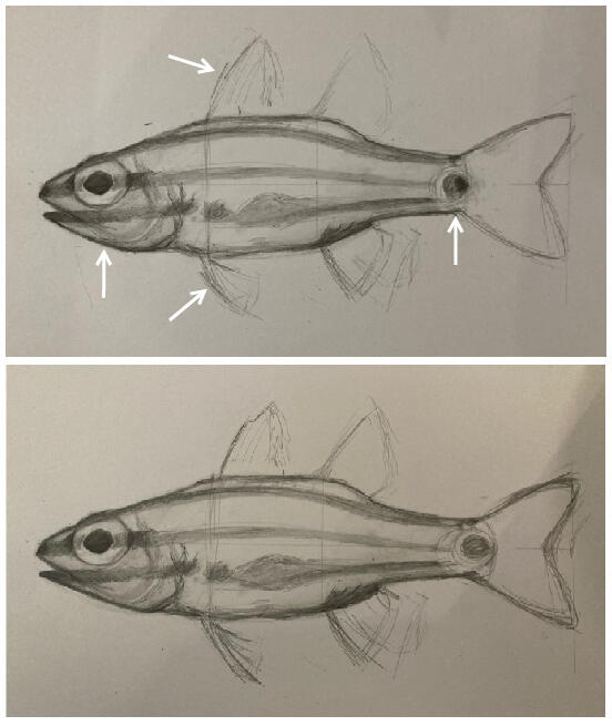
In this slide, I've gathered basic identification information as well as notes on a common misidentification, Cheilodipterus quinquilineatus. FishBase was a great resource for finding exact measurements and other information that wasn't readily available from the Archipelagos Institute.I did a couple of studies before starting the bigger pencil sketch.
An on-site research scientist checked the first rough draft sketch and provided feedback. White arrows point to the areas that needed adjustments: the jaw shape, the fin shapes, and the length and width of the caudal peduncle. Fin rays and teeth were added before the final watercolor.
In order to match the style of the previous ID illustrations in the Archipelagos Institute's database, the rough sketch was transferred to watercolor paper and painted over the course of the next couple days.The scanner was not working, so I took a couple photos outside and worked some magic in Photoshop to clean up the final image.
